Fundamentals
Anatomy of a figure
A matplotlib figure is composed of a hierarchy of elements that, when put together, forms the actual figure as shown on figure fig-anatomy. Most of the time, those elements are not created explicitly by the user but derived from the processing of the various plot commands. Let us consider for example the most simple matplotlib script we can write:
plt.plot(range(10))
plt.show()
In order to display the result, matplotlib needs to create most of the elements shown on figure fig-anatomy. The exact list depends on your default settings (see chapter chap-defaults), but the bare minimum is the creation of a Figure that is the top level container for all the plot elements, an Axes that contains most of the figure elements and of course your actual plot, a line in this case. The possibility to not specify everything might be convenient but in the meantime, it limits your choices because missing elements are created automatically, using default values. For example, in the previous example, you have no control of the initial figure size since it has been chosen implicitly during creation. If you want to change the figure size or the axes aspect, you need to be more explicit:
fig = plt.figure(figsize=(6,6))
ax = plt.subplot(aspect=1)
ax.plot(range(10))
plt.show()
A matplotlib figure is composed of a hierarchy of several elements that, when put together, forms the actual figure (sources: anatomy/anatomy.py). fig-anatomy
In many cases, this can be further compacted using the subplots method.
fig, ax = plt.subplots(figsize=(6,6),
                       subplot_kw={"aspect": 1})
ax.plot(range(10))
plt.show()
Elements
You may have noticed in the previous example that the plot command is attached to ax instead of plt. The use of plt.plot is actually a way to tell matplotlib that we want to plot on the current axes, that is, the last axes that has been created, implicitly or explicitly. No need to remind that explicit is better than implicit as explained in The Zen of Python, by Tim Peters (import this). When you have choice, it is thus preferable to specify exactly what you want to do. Consequently, it is important to know what are the different elements of a figure.
- Figure:
The most important element of a figure is the figure itself. It is created when you call the figure method and we’ve already seen you can specify its size but you can also specify a background color (facecolor) as well as a title (suptitle). It is important to know that the background color won’t be used when you save the figure because the savefig function has also a facecolor argument (that is white by default) that will override your figure background color. If you don’t want any background you can specify transparent=True when you save the figure.
- Axes:
This is the second most important element that corresponds to the actual area where your data will be rendered. It is also called a subplot. You can have one to many axes per figure and each is usually surrounded by four edges (left, top, right and bottom) that are called spines. Each of these spines can be decorated with major and minor ticks (that can point inward or outward), tick labels and a label. By default, matplotlib decorates only the left and bottom spines.
- Axis:
The decorated spines are called axis. The horizontal one is the xaxis and the vertical one is the yaxis. Each of them are made of a spine, major and minor ticks, major and minor ticks labels and an axis label.
- Spines:
Spines are the lines connecting the axis tick marks and noting the boundaries of the data area. They can be placed at arbitrary positions and may be visible or invisible.
- Artist:
Everything on the figure, including Figure, Axes, and Axis objects, is an artist. This includes Text objects, Line2D objects, collection objects, Patch objects. When the figure is rendered, all of the artists are drawn to the canvas. A given artist can only be in one Axes.
Graphic primitives
A plot, independently of its nature, is made of patches, lines and texts. Patches can be very small (e.g. markers) or very large (e.g. bars) and have a range of shapes (circles, rectangles, polygons, etc.). Lines can be very small and thin (e.g. ticks) or very thick (e.g. hatches). Text can use any font available on your system and can also use a latex engine to render maths.
All the graphic primitives (i.e. artists) can be accessed and modified. In the figure above, we modified the boldness of the X axis tick labels (sources: anatomy/bold-ticklabel.py).
Each of these graphic primitives have also a lot of other properties such as color (facecolor and edgecolor), transparency (from 0 to 1), patterns (e.g. dashes), styles (e.g. cap styles), special effects (e.g. shadows or outline), antialiased (True or False), etc. Most of the time, you do not manipulate these primitives directly. Instead, you call methods that build a rendering using a collection of such primitives. For example, when you add a new Axes to a figure, matplotlib will build a collection of line segments for the spines and the ticks and will also add a collection of labels for the tick labels and the axis labels. Even though this is totally transparent for you, you can still access those elements individually if necessary. For example, to make the X axis tick to be bold, we would write:
fig, ax = plt.subplots(figsize=(5,2))
for label in ax.get_xaxis().get_ticklabels():
    label.set_fontweight("bold")
plt.show()
One important property of any primitive is the zorder property that indicates the virtual depth of the primitives as shown on figure fig-zorder. This zorder value is used to sort the primitives from the lowest to highest before rendering them. This allows to control what is behind what. Most artists possess a default zorder value such that things are rendered properly. For example, the spines, the ticks and the tick label are generally behind your actual plot.
Default rendering order of different elements and graphic primitives. The rendering order is from bottom to top. Note that some methods will override these default to position themselves properly (sources: anatomy/zorder.py). fig-zorder
Backends
A backend is the combination of a renderer that is responsible for the actual drawing and an optional user interface that allows to interact with a figure. Until now, we’ve been using the default renderer and interface resulting in a window being shown when the plt.show() method was called. To know what is your default backend, you can type:
import matplotlib
print(matplotlib.get_backend())
In my case, the default backend is MacOSX but yours may be different. If you want to test for an alternative backend, you can type:
import matplotlib
matplotlib.use("xxx")
If you replace xxx with a renderer from table table-renderers below, you’ll end up with a non-interactive figure, i.e. a figure that cannot be shown on screen but only saved on disk.
Renderer |
Type |
Filetype |
|---|---|---|
Agg |
raster |
Portable Network Graphic (PNG) |
PS |
vector |
Postscript (PS) |
vector |
Portable Document Format (PDF) |
|
SVG |
vector |
Scalable Vector Graphics (SVG) |
Cairo |
raster / vector |
PNG / PDF / SVG |
Interface |
Renderer |
Dependencies |
|---|---|---|
GTK3 |
Agg or Cairo |
|
Qt4 |
Agg |
|
Qt5 |
Agg |
|
Tk |
Agg |
|
Wx |
Agg |
|
MacOSX |
— |
OSX (obviously) |
Web |
Agg |
Browser |
The canonical renderer is Agg which uses the Anti-Grain Geometry C++ library to make a raster image of the figure (see figure fig-raster-vector to see the difference between raster and vector). Note that even if you choose a raster renderer, you can still save the figure in a vector format and vice-versa.
Zooming effect for raster graphics and vector graphics (sources: anatomy/raster-vector.py). fig-raster-vector
If you want to have some interaction with your figure, you have to combine one of the available interfaces (see table table-interfaces) with a renderer (e.g. GTK3Cairo that stands for GTK3 interface with Cairo renderer).
For example, to have a rendering in a browser, you can write:
import matplotlib
matplotlib.use('webagg')
import matplotlib.pyplot as plt
plt.show()
Warning
Warning. The use function must be called before importing pyplot.
Once you’ve chosen an interactive backend, you can decide to produce a figure in interactive mode (figure is updated after each matplotlib command):
plt.ion()            # Interactive mode on
plt.plot([1,2,3])    # Plot is shown
plt.xlabel("X Axis") # Label is updated
plt.ioff()           # Interactive mode off
If you want to know more on backends, you can have a look at the matplotlib user guide on the matplotlib website.
An interesting backend under OSX and iterm2 terminal is the imgcat backend that allows to render a figure directly inside the terminal, emulating a kind of jupyter notebook as shown on figure figure-imgcat
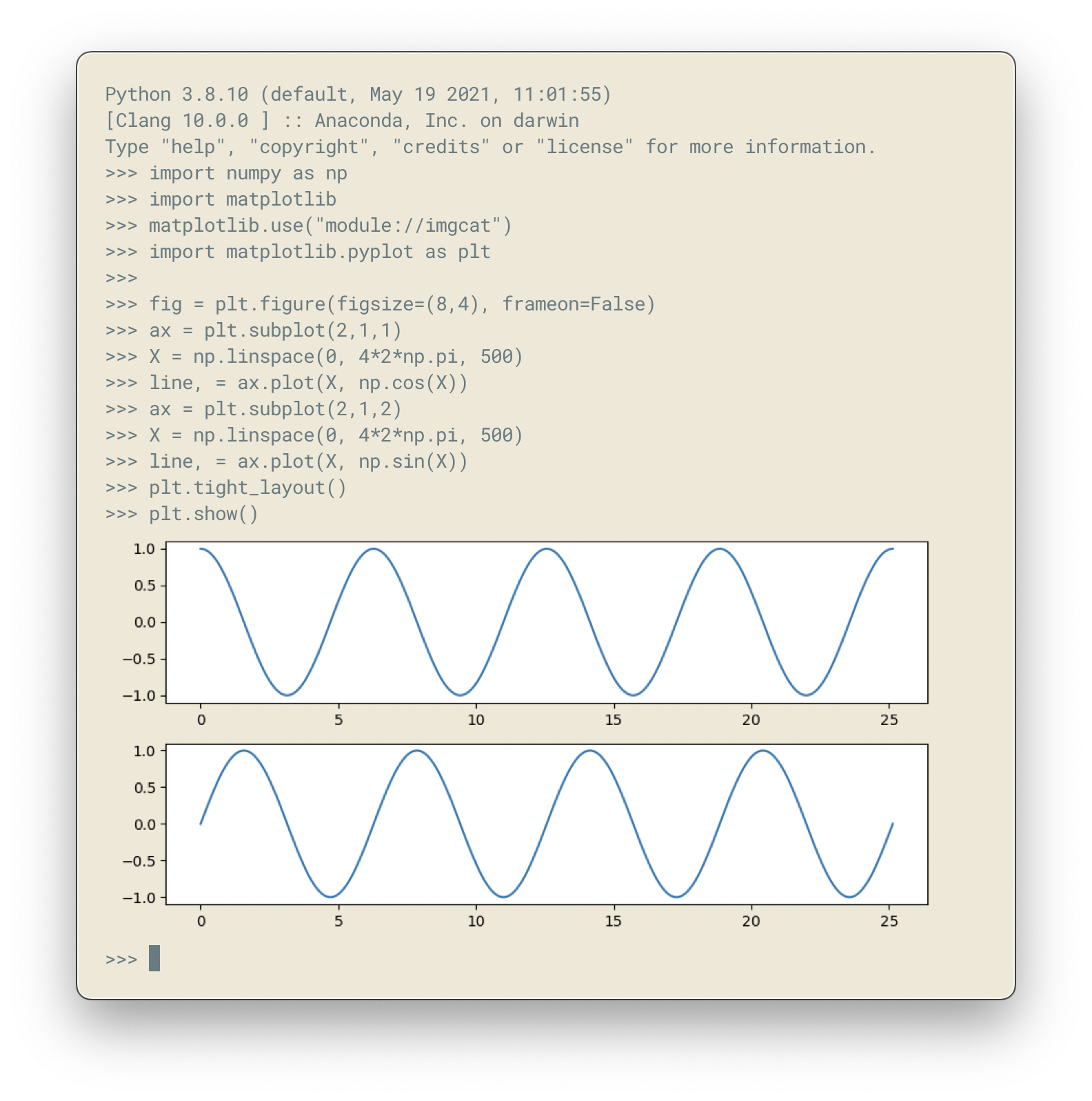
Matplotlib imgcat backend figure-imgcat (sources: anatomy/imgcat.py).
import numpy as np
import matplotlib
matplotlib.use("module://imgcat")
import matplotlib.pyplot as plt

fig = plt.figure(figsize=(8,4), frameon=False)
ax = plt.subplot(2,1,1)
X = np.linspace(0, 4*2*np.pi, 500)
line, = ax.plot(X, np.cos(X))
ax = plt.subplot(2,1,2)
X = np.linspace(0, 4*2*np.pi, 500)
line, = ax.plot(X, np.sin(X))
plt.tight_layout()
plt.show()
For other terminals, you might need to use the sixel backend that may work with xterm (not tested).
Dimensions & resolution
In the first example of this chapter, we specified a figure size of (6,6) that corresponds to a size of 6 inches (width) by 6 inches (height) using a default dpi (dots per inch) of 100. When displayed on a screen, dots corresponds to pixels and we can immediately deduce that the figure size (i.e. window size without the toolbar) will be exactly 600×600 pixels. Same is true if you save the figure in a bitmap format such as png (Portable Network Graphics):
fig = plt.figure(figsize=(6,6))
plt.savefig("output.png")
If we use the identify command from the ImageMagick graphical suite to enquiry about the produced image, we get:
$ identify -verbose output.png
Image: output.png
  Format: PNG (Portable Network Graphics)
  Mime type: image/png
  Class: DirectClass
  Geometry: 600x600+0+0
  Resolution: 39.37x39.37
  Print size: 15.24x15.24
  Units: PixelsPerCentimeter
  Colorspace: sRGB
  ...
This confirms that the image geometry is 600×600 while the resolution is 39.37 ppc (pixels per centimeter) which corresponds to 39.37*2.54 ≈ 100 dpi (dots per inch). If you were to include this image inside a document while keeping the same dpi, you would need to set the size of the image to 15.24cm by 15.24cm. If you reduce the size of the image in your document, let’s say by a factor of 3, this will mechanically increase the figure dpi to 300 in this specific case. For a scientific article, publishers will generally request figures dpi to be between 300 and 600. To get things right, it is thus good to know what will be the physical dimension of your figure once inserted into your document.

A text rendered in matplotlib and saved using different dpi (50,100,300 & 600) (sources: anatomy/figure-dpi.py). figure-dpi
For a more concrete example, let us consider this book whose format is A5 (148×210 millimeters). Right and left margins are 20 millimeters each and images are usually displayed using the full text width. This means the physical width of an image is exactly 108 millimeters, or approximately 4.25 inches. If we were to use the recommended 600 dpi, we would end up with a width of 2550 pixels which might be beyond screen resolution and thus not very convenient. Instead, we can use the default matplotlib dpi (100) when we display the figure on the screen and only when we save it, we use a different and higher dpi:
def figure(dpi):
    fig = plt.figure(figsize=(4.25,.2))
    ax = plt.subplot(1,1,1)
    text = "Text rendered at 10pt using %d dpi" % dpi
    ax.text(0.5, 0.5, text, ha="center", va="center",
            fontname="Source Serif Pro",
            fontsize=10, fontweight="light")
    plt.savefig("figure-dpi-%03d.png" % dpi, dpi=dpi)

figure(50), figure(100), figure(300), figure(600)
Figure figure-dpi shows the output for the different dpi. Only the 600 dpi output is acceptable. Note that when it is possible, it is preferable to save the result in PDF (Portable Document Format) because it is a vector format that will adapt flawlessly to any resolution. However, even if you save your figure in a vector format, you still need to indicate a dpi for figure elements that cannot be vectorized (e.g .images).
Finally, you may have noticed that the font size on figure figure-dpi appears to be the same as the font size of the text you’re currently reading. This is not by accident since this Latex document uses a font size of 10 points and the matplotlib figure also uses a font size of 10 points. But what is a point exactly? In Latex, a point (pt) corresponds to 1/72.27 inches while in matplotlib it corresponds to 1/72 inches.
To help you visualize the exact dimension of your figure, it is possible to add a ruler to a figure such that it displays current figure dimension as shown on figure figure-ruler. If you manually resize the figure, you’ll see that the actual dimension of the figure changes while if you only change the dpi, the size will remain the same. Usage is really simple:
import ruler
import numpy as np
import matplotlib.pyplot as plt

fig,ax = plt.subplots()
ruler = ruler.Ruler(fig)
plt.show()
Interactive ruler figure-ruler (anatomy/ruler.py).
Exercise
It’s now time to try to make some simple exercises gathering all the concepts we’ve seen so far (including finding the relevant documentation).
Exercise 1 Try to produce a figure with a given (and exact) pixel size (e.g. 512x512 pixels). How would you specify the size and save the figure?
Pixel font text using exact image size figure-pixel-font (anatomy/pixel-font.py).
Exercise 2 The goal is to make the figure figure-inch-cm that shows a dual axis, one in inches and one in centimeters. The difficulty is that we want the centimeters and inched to be physically correct when printed. This requires some simple computations for finding the right size and some trials and errors to make the actual figure. Don’t pay too much attention to all the details, the essential part is to get the size right.
Inches/centimeter conversion figure-inch-cm (solution: anatomy/inch-cm.py).
Exercise 3
Here we’ll try to reproduce the figure figure-zorder-plots. If you look at the figure, you’ll realize that each curve is partially covering other curves and it is thus important to set a proper zorder for each curve such that the rendering will be independent of drawing order. For the actual curves, you can start from the following code:
def curve():
    n = np.random.randint(1,5)
    centers = np.random.normal(0.0,1.0,n)
    widths = np.random.uniform(5.0,50.0,n)
    widths = 10*widths/widths.sum()
    scales = np.random.uniform(0.1,1.0,n)
    scales /= scales.sum()
    X = np.zeros(500)
    x = np.linspace(-3,3,len(X))
    for center, width, scale in zip(centers, widths, scales):
        X = X + scale*np.exp(- (x-center)*(x-center)*width)
    return X
Multiple plots partially covering each other figure-zorder-plots (solution: anatomy/zorder-plots.py).
Coordinate systems
In any matplotlib figure, there is at least two different coordinate systems that co-exist anytime. One is related to the figure (FC) while the others are related to each of the individual plots (DC). Each of these coordinate systems exists in normalized (NxC) or native version (xC) as illustrated in figures fig-coordinates-cartesian and fig-coordinates-polar. To convert a coordinate from one system to the other, matplotlib provides a set of transform functions:
fig = plt.figure(figsize=(6, 5), dpi=100)
ax = fig.add_subplot(1, 1, 1)
ax.set_xlim(0,360), ax.set_ylim(-1,1)

#  FC : Figure coordinates (pixels)
# NFC : Normalized figure coordinates (0 → 1)
#  DC : Data coordinates (data units)
# NDC : Normalized data coordinates (0 → 1)

DC_to_FC = ax.transData.transform
FC_to_DC = ax.transData.inverted().transform

NDC_to_FC = ax.transAxes.transform
FC_to_NDC = ax.transAxes.inverted().transform

NFC_to_FC = fig.transFigure.transform
FC_to_NFC = fig.transFigure.inverted().transform
The co-existing coordinate systems within a figure using Cartesian projection. FC: Figure Coordinates, NFC Normalized Figure Coordinates, DC: Data Coordinates, NDC: Normalized Data Coordinates. fig-coordinates-cartesian
The co-existing coordinate systems within a figure using Polar projection. FC: Figure Coordinates, NFC Normalized Figure Coordinates, DC: Data Coordinates, NDC: Normalized Data Coordinates. fig-coordinates-polar
Let’s test these functions on some specific points (corners):
# Top right corner in normalized figure coordinates
print(NFC_to_FC([1,1]))  # (600,500)

# Top right corner in normalized data coordinates
print(NDC_to_FC([1,1]))  # (540,440)

# Top right corner in data coordinates
print(DC_to_FC([360,1])) # (540,440)
Since we also have the inverse functions, we can create our own transforms. For example, from native data coordinates (DC) to normalized data coordinates (NDC):
# Native data to normalized data coordinates
DC_to_NDC = lambda x: FC_to_NDC(DC_to_FC(x))

# Bottom left corner in data coordinates
print(DC_to_NDC([0, -1]))  # (0.0, 0.0)

# Center in data coordinates
print(DC_to_NDC([180,0]))  # (0.5, 0.5)

# Top right corner in data coordinates
print(DC_to_NDC([360,1]))  # (1.0, 1.0)
When using Cartesian projection, the correspondence is quite clear between the normalized and native data coordinates. With other kind of projection, things work just the same even though it might appear less obvious. For example, let us consider a polar projection where we want to draw the outer axes border. In normalized data coordinates, we know the coordinates of the four corners, namely (0,0), (1,0), (1,1) and (0,1). We can then transform these normalized data coordinates back to native data coordinates and draw the border. There is however a supplementary difficulty because those coordinates are beyond the axes limit and we’ll need to tell matplotlib to not care about the limit using the clip_on arguments.
fig = plt.figure(figsize=(5, 5), dpi=100)
ax = fig.add_subplot(1, 1, 1, projection='polar')

FC_to_DC = ax.transData.inverted().transform
NDC_to_FC = ax.transAxes.transform
NDC_to_DC = lambda x: FC_to_DC(NDC_to_FC(x))
P = NDC_to_DC([[0,0], [1,0], [1,1], [0,1], [0,0]])

plt.plot(P[:,0], P[:,1], clip_on=False, zorder=-10
         color="k", linewidth=1.0, linestyle="--", )
plt.scatter(P[:-1,0], P[:-1,1],
           clip_on=False, facecolor="w", edgecolor="k")
plt.show()
The result is shown on figure fig-transforms-polar.
Axes boundaries in polar projection using a transform from normalized data coordinates to data coordinates (coordinates/transform-polar.py). fig-transforms-polar
However, most of the time, you won’t need to use these transform functions explicitly but rather implicitly. For example, consider the case where you want to add some text over a specific plot. For this, you need to use the text function and specify what is to be written (of course) and the coordinates where you want to display the text. The question (for matplotlib) is how to consider these coordinates? Are they expressed in data coordinates? normalized data coordinates? normalized figure coordinates? The default is to consider they are expressed in data coordinates. Consequently, if you want to us a different system, you’ll need to explicitly specify a transform when calling the function. Let’s say for example we want to add a letter on the bottom left corner. We can write:
fig = plt.figure(figsize=(6, 5), dpi=100)
ax = fig.add_subplot(1, 1, 1)

ax.text(0.1, 0.1, "A", transform=ax.transAxes)
plt.show()
The letter will be placed at 10% from the left spine and 10% from the bottom spine. If the two spines have the same physical size (in pixels), the letter will be equidistant from the right and bottom spines. But, if they have different size, this won’t be true anymore and the results will not be very satisfying (see panel A of figure fig-transforms-letter). What we want to do instead is to specify a transform that is a combination of the normalized data coordinates (0,0) plus an offset expressed in figure native units (pixels). To do that, we need to build our own transform function to compute the offset:
from matplotlib.transforms import ScaledTranslation

fig = plt.figure(figsize=(6, 4))

ax = fig.add_subplot(2, 1, 1)
plt.text(0.1, 0.1, "A", transform=ax.transAxes)

ax = fig.add_subplot(2, 1, 2)
dx, dy = 10/fig.dpi, 10/fig.dpi
offset = ScaledTranslation(dx, dy, fig.dpi_scale_trans)
plt.text(0, 0, "B", transform=ax.transAxes + offset)

plt.show()
The result is illustrated on panel B of figure fig-transforms-letter. The text is now properly positioned and will stay at the right position independently of figure aspect ratio or data limits.
Using transforms to position precisely a text over a plot. Top panel uses normalized data coordinates (0.1,0.1), bottom panel uses normalized data coordinates (0.0,0.0) plus an offset (10,10) expressed in figure coordinates (coordinates/transform-letter.py). fig-transforms-letter
Things can become even more complicated when you need a different transform on the X and Y axis. Let us consider for example the case where you want to add some text below the X tick labels. The X position of the tick labels is expressed in data coordinates, but how do we put something under as illustrated on figure fig-transforms-blend?
Precise placement (arrows below X axis tick labels) using blended transform (coordinates/transforms-blend.py). fig-transforms-blend
The natural unit for text is point and we thus want to position our arrow using a Y offset expressed in points. To do that, we need to use a blend transform:
point = 1/72
fontsize = 12
dx, dy = 0, -1.5*fontsize*point
offset = ScaledTranslation(dx, dy, fig.dpi_scale_trans)
transform = blended_transform_factory(
                 ax.transData, ax.transAxes+offset)
We can also use transformations to a totally different usage as shown on figure figure-collage. To obtain such figure, I rewrote the imshow function to apply translation, scaling and rotation and I call the function 200 times with random values.
def imshow(ax, I, position=(0,0), scale=1, angle=0):
    height, width = I.shape
    extent = scale * np.array([-width/2, width/2,
                               -height/2, height/2])
    im = ax.imshow(I, extent=extent, zorder=zorder)
    t = transforms.Affine2D().rotate_deg(angle).translate(*position)
    im.set_transform(t + ax.transData)

Collage figure-collage (sources: coordinates/collage.py).
Transformations are quite powerful tools even though you won’t manipulate them too often in your daily life. But there are a few cases where you’ll be happy to know about them. You can read further on transforms and coordinates with the Transformation tutorial on the matplotlib website.
Real case usage
Let’s now study a real case of transforms as shown on figure fig-transforms-hist. This is a simple scatter plot showing some Gaussian data, with two principal axis. I added a histogram that is orthogonal to the first principal component axis to show the distribution on the main axis. This figure might appear simple (a scatter plot and an oriented histogram) but the reality is quite different and rendering such a figure is far from obvious. The main difficulty is to have the histogram at the right position, size and orientation knowing that position must be set in data coordinates, size must be given in figure normalized coordinates and orientation in degrees. To complicate things, we want to express the elevation of the text above the histogram bars in data points.
Rotated histogram aligned with second main PCA axis (coordinates/transforms-hist.py). fig-transforms-hist
You can have a look at the sources for the complete story but let’s concentrate on the main difficulty, that is adding a rotated floating axis. Let us start with a simple figure:
import numpy as np
import matplotlib.pyplot as plt
from matplotlib.transforms import Affine2D
import mpl_toolkits.axisartist.floating_axes as floating

fig = plt.figure(figsize=(8,8))
ax1 = plt.subplot(1,1,1, aspect=1,
                  xlim=[0,10], ylim=[0,10])
Let’s imagine we want to have a floating axis whose center is (5,5) in data coordinates, size is (5,3) in data coordinates and orientation is -30 degrees:
center = np.array([5,5])
size = np.array([5,3])
orientation = -30
T = size/2*[(-1,-1), (+1,-1), (+1,+1), (-1,+1)]
rotation = Affine2D().rotate_deg(orientation)
P = center + rotation.transform(T)
In the code above, we defined the four points delimiting the extent of our new axis and we took advantage of matplotlib affine transforms to do the actual rotation. At this point, we have thus four points describing the border of the axis in data coordinates and we need to transform them in figure normalized coordinates because the floating axis requires normalized figure coordinates.
DC_to_FC = ax1.transData.transform
FC_to_NFC = fig.transFigure.inverted().transform
DC_to_NFC = lambda x: FC_to_NFC(DC_to_FC(x))
We have one supplementary difficulty because the position of a floating axis needs to be defined in terms of the non-rotated bounding box:
xmin, ymin = DC_to_NFC((P[:,0].min(), P[:,1].min()))
xmax, ymax = DC_to_NFC((P[:,0].max(), P[:,1].max()))
We now have all the information to add our new axis:
transform = Affine2D().rotate_deg(orientation)
helper = floating.GridHelperCurveLinear(
              transform, (0, size[0], 0, size[1]))
ax2 = floating.FloatingSubplot(
              fig, 111, grid_helper=helper, zorder=0)
ax2.set_position((xmin, ymin, xmax-xmin, ymax-xmin))
fig.add_subplot(ax2)
The result is shown on figure fig-transforms-floating-axis.
Exercise
Exercise 1 When you specify the size of markers in a scatter plot, this size is expressed in points. Try to make a scatter plot whose size is expressed in data points such as to obtain figure fig-transforms-exercise-1.
A scatter plot whose marker size is expressed in data coordinates instead of points (coordinates/transforms-exercise-1.py). fig-transforms-exercise-1
A floating and rotated floating axis with controlled position size and rotation (coordinates/transforms-floating-axis.py). fig-transforms-floating-axis
Scales & projections
Beyond affine transforms, matplotlib also offers advanced transformations that allows to drastically change the representation of your data without ever modifying it. Those transformations correspond to a data preprocessing stage that allows you to adapt the rendering to the nature of your data. As explained in the matplotlib documentation, there are two main families of transforms: separable transformations, working on a single dimension, are called scales, and non-separable transformations, that handle data in two or more dimensions at once are called projections.
Scales
Scales provide a mapping mechanism between the data and their representation in the figure along a given dimension. Matplotlib offers four different scales (linear, log, symlog and logit) and takes care, for each of them, of modifying the figure such as to adapt the ticks positions and labels (see figure figure-scales). Note that a scale can be applied to x axis only (set_xscale), y axis only (set_yscale) or both.
Comparison of the linear, log and logit scales. figure-scales (sources: scales-projections/scales-comparison.py).
The default (and implicit) scale is linear and it is thus generally not necessary to specify anything. You can check if a scale is linear by comparing the distance between three points in the figure coordinates (actually we should compare every points but you get the idea) and check whether their difference in data space is the same as in figure space modulo a given factor (see scales-projections/scales-check.py):
>>> fig = plt.figure(figsize=(6,6))
>>> ax = plt.subplot(1, 1, 1,
                     aspect=1, xlim=[0,100], ylim=[0,100])
>>> P0, P1, P2, P3 = (0.1, 0.1), (1,1), (10,10), (100,100)
>>> transform = ax.transData.transform
>>> print( (transform(P1)-transform(P0))[0] )
4.185
>>> print( (transform(P2)-transform(P1))[0] )
41.85
>>> print( (transform(P3)-transform(P2))[0] )
418.5
Logarithmic scale (log) is a nonlinear scale where, instead of increasing in equal increments, each interval is increased by a factor of the base of the logarithm (hence the name). Log scales are used for values that are strictly positive since the logarithm is undefined for negative and null values. If we apply the previous script to check the difference in data and figure space, you can now see the distances are the same:
>>> fig = plt.figure(figsize=(6,6))
>>> ax = plt.subplot(1, 1, 1,
                     aspect=1, xlim=[0.1,100], ylim=[0.1,100])
>>> ax.set_xscale("log")
>>> P0, P1, P2, P3 = (0.1, 0.1), (1,1), (10,10), (100,100)
>>> transform = ax.transData.transform
>>> print( (transform(P1)-transform(P0))[0] )
155.0
>>> print( (transform(P2)-transform(P1))[0] )
155.0
>>> print( (transform(P3)-transform(P2))[0] )
155.0
If your data has negative values, you have to use a symmetric log scale (symlog) that is a composition of both a linear and a logarithmic scale. More precisely, values around 0 use a linear scale and values outside the vicinity of zero uses a logarithmic scale. You can of course specify the extent of the linear zone when you set the scale. The logit scale is used for values in the range ]0,1[ and uses a logarithmic scale on the “border” and a quasi-linear scale in the middle (around 0.5). If none of these scales suit your needs, you still have the option to define your own custom scale:
def forward(x):
    return x**(1/2)
def inverse(x):
    return x**2

ax.set_xscale('function', functions=(forward, inverse))
In such case, you have to provide both the forward and inverse function that allows to transform your data. The inverse function is used when displaying coordinates under the mouse pointer.
Custom (user defined) scales. figure-scales-custom (sources: scales-projections/scales-custom.py).
Finally, if you need a custom scale with complex transforms, you may need to write a proper scale object as it is explained on the matplotlib documentation.
Projections
Projections are a bit more complex than scales but in the meantime much more powerful. Projections allows you to apply arbitrary transformation to your data before rendering them in a figure. There is no real limit on the kind of transformation you can apply as long as you know how to transform your data into something that will be 2 dimensional (the figure space) and reciprocally. In other words, you need to define a forward and an inverse transformation. Matplotlib comes with only a few standard projections but offers all the machinery to create new domain-dependent projection such as for example cartographic projection. You might wonder why there are so few native projections. The answer is that it would be too time-consuming and too difficult for the developers to implement and maintain each and every projections that are domain specific. They chose instead to restrict projection to the most generic ones, namely polar and 3d.
We’ve already seen the polar projection in the previous chapter. The most simple and straightforward way to use is to specify the projection when you create an axis:
ax = plt.subplot(1, 1, 1, projection='polar')
This axis is now equipped with a polar projection. This means that any plotting command you apply is pre-processed such as to apply (automatically) the forward transformation on the data. In the case of a polar projection, the forward transformation must specify how to go from polar coordinates \((\rho, \theta)\) to Cartesian coordinates \((x,y) = (\rho cos(\theta), \rho sin(\theta))\). When you declare a polar axis, you can specify limits of the axis as we’ve done previously but we have also some dedicated settings such as set_thetamin, set_thetamax, set_rmin, set_rmax and more specifically set_rorigin. This allows you to have fine control over what is actually shown as illustrated on the figure figure-projection-polar-config.
Polar projection figure-projection-polar-config (sources: scales-projections/projection-polar-config.py).
If you now try to do some plots (e.g. plot, scatter, bar), you’ll see that everything is transformed but a few elements. More precisely, the shape of markers is not transformed (a disc marker will remains a disc visually), the text is not transformed (such that it remains readable) and the width of lines is kept constant. Let’s have a look at a more elaborate figure to see what it means more precisely. On figure figure-projection-polar-histogram, I plotted a simple signal using mostly fill_between command. The concentric grey/white colored rings are made using the fill_between command between two different \(\rho\) values while the histogram is made with various \(\rho\) values. If you now look more closely at the \(\rho\) axis with ticks ranging from 100 to 900, you can observe that the ticks have the same vertical size. It is indeed an anomaly I introduced deliberately for purely aesthetic reasons. If I had specified these ticks using a plot command, the length of each tick would correspond to a difference of angle (for the vertical size) and they would become taller and taller as we move away from the center. To have regulars ticks, we thus have to do some computations using the inverse transform (remember, a projection is a forward and an inverse transform). I won’t give all the details here but you can read the code (projection-polar-histogram.py) to see how it is made. Note that the actual role of the inverse transformation is to link mouse coordinates (in Cartesian 2D coordinates) back to your data.
Polar projection with better defaults. figure-projection-polar-histogram (sources: scales-projections/projection-polar-histogram.py).
Conversely, there are some situations were we might be interested in having the text and the markers to be transformed as illustrated on figure figure-text-polar.
Polar projection with transformation of text and markers. figure-text-polar (sources: scales-projections/text-polar.py).
On this example, both the markers and the text have been transformed manually. For the markers, the trick is to use Ellipses that are approximated as a sequence of small line segments, each of them being transformed. In the corresponding code, I only specify the center, and the size of the pseudo-marker and the pre-processing stage takes care of applying the polar projection to each individual parts composing the marker (ellipse), resulting in a slightly curved ellipse. For the text, the process is the same but it is a bit more complicated since we need first to convert the text into a path that can be transformed (we’ll see that in more detail in the next chapter).
The second projection that matplotlib offers is the 3d projection, that is the projection from a 3D Cartesian space to a 2 Cartesian space. To start using 3D projection, you’ll need to use the Axis3D toolkit that is generally shipped with matplotlib:
from mpl_toolkits.mplot3d import Axes3D
ax = plt.subplot(1, 1, 1, projection='3d')
With this 3D axis, you can use regular plotting commands with a big difference though: you need now to provide 3 coordinates (x,y,z) where you previously provided only two (x,y) as illustrated on figure figure-projection-3d-frame. Note that this figure is quite different from the default 3D axis you may get from matplotlib. Here, I tweaked every setting I can think of to try to improve the default look and to show how things can be changed. Have a look at the corresponding code and try to modify some settings to see the actual effect. The 3D Axis API is fairly well documented on the matplotlib website and I won’t explain each and every command.
Note
Note The 3D axis projection is limited by the absence of a proper depth-buffer. This is not a bug (nor a feature) and this results in some glitches between the elements composing a figure.
Three dimensional projection figure-projection-3d-frame (sources: scales-projections/projection-3d-frame.py).
For other type of projections, you’ll need to install third-party packages depending on the type of projection you intend to use:
- Cartopy
is a Python package designed for geospatial data processing in order to produce maps and other geospatial data analyses. Cartopy makes use of the powerful PROJ.4, NumPy and Shapely libraries and includes a programmatic interface built on top of Matplotlib for the creation of publication quality maps.
- GeoPandas
is an open source project to make working with geospatial data in python easier. GeoPandas extends the data types used by pandas to allow spatial operations on geometric types. Geometric operations are performed by Shapely. Geopandas further depends on fiona for file access and descartes and matplotlib for plotting.
- Python-ternary
is a plotting library for use with matplotlib to make ternary plots in the two dimensional simplex projected onto a two dimensional plane. The library provides functions for plotting projected lines, curves (trajectories), scatter plots, and heatmaps. There are several examples and a short tutorial below.
- pySmithPlot
is a matplotlib extension providing a projection class for creating high quality Smith Charts with Python. The generated plots blend seamlessly into matplotlib’s style and support almost the full range of customization options.
- Matplotlib-3D
is an experimental project that attempts to provide a better and more versatile 3d axis for Matplotlib.
If you’re still not satisfied with existing projections, your last option is to create your own projection but this is quite an advanced operation even though the matplotlib documentation provides some examples
Exercises
Exercise 1 Considering functions \(f(x) = 10^x\), \(f(x) = x\) and \(f(x) = log_{10}(x)\), try to reproduce figure figure-scales-log-log.
Combining linear and logarithmic scales. figure-scales-log-log (sources: scales-projections/scales-log-log.py).
Exercise 2 The goal is to produce a figure showing microphone polar patterns (omnidirectional, subcardioid, cardioid, supercardioid, bidirectional and shotgun). The first five patterns are simple functions where radius evolves with angle, while the last pattern may require some work.
Microphone polar patterns figure-polar-patterns (sources: scales-projections/polar-patterns.py).
Elements of typography
Typography is the art of arranging type to make written language legible, readable, and appealing when displayed (Wikipedia). However, for the neophyte, typography is mostly apprehended as the juxtaposition of characters displayed on the screen while for the expert, typography means typeface, scripts, unicode, glyphs, ascender, descender, tracking, hinting, kerning, shaping, weight, slant, etc. Typography is actually much more than the mere rendering of glyphs and involves many different concepts. If glyph rendering is an important part of the rendering pipeline as it will be explained below, it is nonetheless important to have a basic understanding of typography. Unfortunately, I cannot write here a full course on typography and I advise the interested reader to read Practical Typography by Matthew Butterick. This open access book introduces the main concepts and give sound advice to improve your written documents.
At this point, you could object that a scientific figure possesses only a few places with written text and it is thus not that important. And yet, it is. Let’s have a look at figure figure-typography-matters that differs only at the typographic level. The top part is the default typographic choices of Matplotlib in terms of font families, slant, weight and size. Those defaults are actually already quite good but can be slightly improved as shown on the bottom figure which was made using different font families (Roboto Condensed and Roboto Slab), size and weights. The difference might appear subtle but is really an important dimension of a scientific figure.
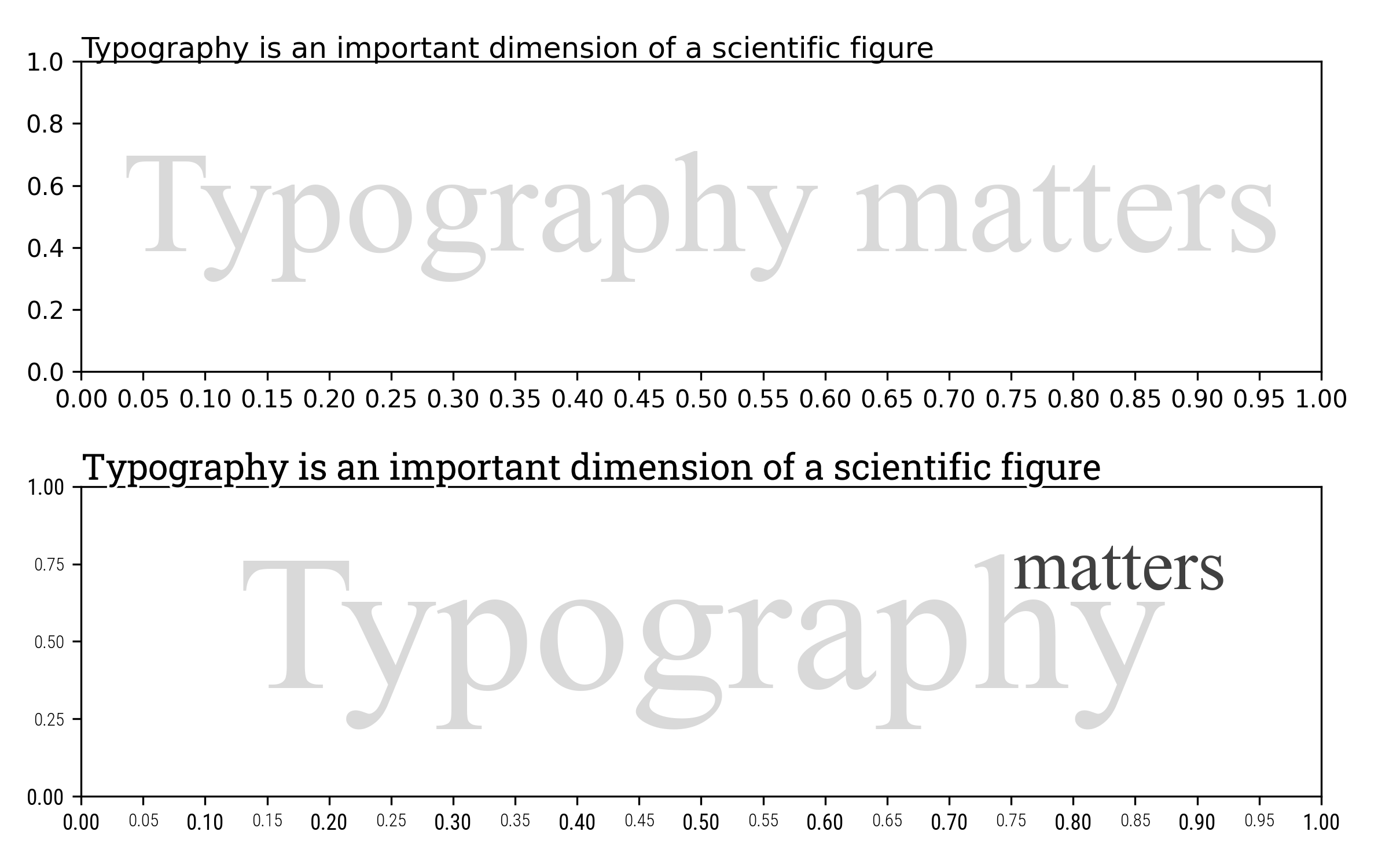
Influence of typography on the perception of a figure figure-typography-matters (sources: typography/typography-matters.py).
Unfortunately, there’s no magical recipe to tell you how to tweak typography for a given figure and it depends on a number of factors over which you have no real control most of the time. For example, consider a figure you make for inclusion in an article that will be published in a scientific journal. These kind of journals possess a template which dictate the future layout of your article (if accepted) as well as a font stack, that is, a choice of fonts for main body, bibliography and peripheral information. If you want your figure to have a good appearance, you’ll need to choose your fonts accordingly. To do that, you can have a look at fonts installed on your system or browse online galleries such as Font squirrel, dafont.com or Google font.
If you install a new font on your system, don’t forget to rebuild the font list cache or Matplotlib will just ignore you newly installed font:
import matplotlib.font_manager
matplotlib.font_manager._rebuild()
Font stacks
The Matplotlib font stack is defined using four different typeface families, namely sans, serif, monospace and cursive. The default font stack is based on the DejaVu fonts that are based on the Bitstream Vera fonts. DejaVu fonts offer good unicode coverage but they come with only two weights (regular and bold) which might be a bit limiting and the project seems to have been abandoned since 2016. The default cursive font is Apple Chancery. Note however that these are only the primary default choices and Matplotlib can fall back to other typefaces if the defaults are not installed. To check which font is actually used, you can type:
from matplotlib.font_manager import findfont, FontProperties
for family in ["serif", "sans", "monospace", "cursive"]:
    font = findfont(FontProperties(family=family))
    print(family, ":" , os.path.basename(font))
You can also design your own font stack by choosing a set of alternative font families. Figure figure-typography-font-stacks shows some alternative font stacks based on the Roboto and Source Pro Family which both have serif, sans and monospace typefaces and comes with several weights.
Font stack alternatives figure-typography-font-stacks (sources: typography/typography-font-stacks.py).
This font stack can be used as the default by modifying either the rc file or the stylesheet (we’ll see that in the section chap-defaults) but you can also use a specific font face for any textual object such as tick labels, legend, figure title, etc. However, for consistency, it’s better to use the same family of fonts (serif, sans and mono) for the whole figure.
Rendering mathematics
The case of mathematical text is slightly more complicated because it requires several different fonts possessing all the necessary mathematical symbols and there are not so many such fonts. Matplotlib offers five different families, namely DejaVu (sans and serif), Styx (sans and serif) and computer modern:
Mathematics font stacks. figure-typography-math-stacks (sources: typography/typography-math-stacks.py).
Matplotlib possesses its own TeX parser and layout engine which is quite capable even though it suffers from some imperfections. For comparison, here is the same mathematical expression as rendered by LaTeX:
We can notice some obvious differences (alignment, weights, line widths). If this is unacceptable for your case, you still have the option to use the real TeX engine by setting the usetex variable:
import matplotlib as mpl
plt.rcParams.update({"text.usetex": True})
A note about size
When you manipulate textual objects you need to specify a size (either explicitly or through the defaults) that is expressed in point (pt). In matplotlib, a point corresponds to 1/72 inches (0.35mm) (while for LaTeX, a point corresponds to 1/72.27 inches). The question is then what does this size measure exactly? It corresponds to 1 em which is a typographic unit and more or less corresponds to a bounding box that can contain any glyphs. No need to say more at this point because the important information is that font sizes are specified in inches and the apparent size is thus directly linked to the resolution of your figure (not the dimension) through the dots per inch (dpi) parameter. You can thus define either a very large or tiny figure, and a font with size 10 will have the same visual aspects on your screen.
Exercise Using different fonts, weights and size, try to reproduce the figure figure-tick-labels-variation.
Tick label variations figure-tick-labels-variation (sources: typography/tick-labels-variation.py).
Legibility
For a traditional document, text is usually rendered in black against a white background that maximizes legibility. The case of scientific visualization is a bit different because there are some situations where you cannot control the background color since it is part of your results.
Typograpy legibility variations. figure-typography-legibility (sources: typography/typography-legibility.py).
This is especially true if you add text over an image such as shown on figure figure-typography-legibility. The first line shows what happens if you add white or black text over a random grey image. The result is nearly impossible to read unless you zoom in. The second line is a bit better thanks to the weight of the font that has been made heavier but the text remains difficult to read. On the third line, I added a semi-transparent background to enhance contrast. This dramatically improves legibility but the result is not really aesthetic and hides a lot of data in the meantime. The best option is shown on the last line where I outlined the font with a thin border. Here the text is legible, aesthetic and does not hide too much data.
Exercise Try to reproduce exactly the figure figure-text-outline which uses the Pacifico font family. Colors come from the magma colormap. Make sure to use different outline widths to get the thin black line between each color.
Text with far too many outlines. figure-text-outline (sources: typography/text-outline.py).
At this point, it is important to understand that Matplotlib offers two types of textual object. The first and most commonly used is the regular Text that is used for labels, titles or annotations. It cannot be heavily transformed and most of the time, the text is rendered following a single direction (e.g.horizontal or vertical) even though it can be freely rotated. There exists however another type of textual object which is the TextPath. Usage is very simple:
from matplotlib.textpath import TextPath
from matplotlib.patches import PathPatch
path = TextPath((0,0), "ABC", size=12)
The result is a path object that can be inserted in a figure
patch = PathPatch(path)
ax.add_artist(patch)
What is really interesting with such path objects is that it can now be transformed at the level of individual vertices composing a glyph as shown on figure figure-typography-text-path.
Better contour labels using text path. figure-typography-text-path (sources: typography/typography-text-path.py).
In this example, I replaced the regular contour labels with text path objects that follow the path. It requires some computations but not that much actually. The result is aesthetically better to me but it must be used wisely. If your contour lines are too small or possess sharp turns, it will make the text unreadable.
Example of 3D text paths. figure-projection-3d-gaussian (sources: typography/projection-3d-gaussian.py).
Another interesting usage of text path is the case of 3D projection as illustrated on figure figure-projection-3d-gaussian. On this figure, I took advantage of the 3D text API to orient and project tick labels and axes titles. Note that such projection is fine as long as the figure is properly oriented. If you rotate, text might be difficult to read and this is the reason why the default for 3d projection is to have text that always face the camera, ensuring legibility.
Exercise Try to reproduce figures figure-text-starwars. A simple compression on X vertices depending on the Y level should work. Vertices of a path can be accessed with path.vertices.
In a far distant galaxy. figure-text-starwars (sources: typography/text-starwars.py).
A primer on colors
Color is a highly complex topic and a whole book would probably not be enough to explain each and every aspect. This is the reason why I won’t try to explain everything here, the other reason being that I’m simply not knowledgeable enough on the topic. There are nonetheless a few things that are good to know, for example how are colors represented on a computer. To represent a color on a computer, we use (most of the time) the notion of a color model (how do we represent a color) and a color space (what colors can be represented). There exists several color models (RGB, HSV, HLS, CMYK, CIEXYZ, CIELAB, etc.) and several color spaces (Adobe RGB, sRGB, Colormatch RGB, etc.) such that you can access the same color space using different color models. The standard for computers (since 1996) is the sRGB color space where the s stands for standard. This color space uses an additive color model based on the RGB model. This means that to obtain a given color, you need to mix different amounts of red, green, and blue light. When these amounts are all zero, you obtain black and when these amounts are all at full intensity, you obtain white (D65 white point, see CIE 1931 xy chromaticity space).
Consequently, when you specify a color in matplotlib (e.g. “#123456”), you need to realize that this color is implicitly encoded in the sRGB color model and space. This draws immediate consequences. For example, if you try to produce a gradient between two colors using a naive approach, you’ll get wrong perceptual results because the sRGB model is not linear. This is illustrated on figure figure-color-gradients where I plotted gradients using the sRGB naive approach (first line on each gradient). You can observe that the result is far from being satisfactory. A better way to build a gradient is to first convert colors to the linear RGB space, apply the gradient, and then convert it back to the sRGB color model. This is illustrated on the second line of each gradient that are now perceptually smoother. A third (and better) solution is to use the CIE Lab model that has been tailored to the human perception and provides a perceptually uniform space. It is a bit more complicated to manipulate and you’ll need external packages such as scikit-image or colour to make the conversion between the different models and spaces, but results are worth the effort.
Linear color gradients using different color models figure-color-gradients (sources: colors/color-gradients.py).
Another popular model is the HSV model that stands for Hue, Saturation and Value (see figure figure-color-wheel). It provides an alternate color model to access the same color space as the sRGB system. Matplotlib provides methods to convert to and from the HSV model (see the colors module).
Color wheel (HSV) figure-color-wheel (sources: colors/color-wheel.py).
Choosing colors
Maybe at this point the only question you have in mind is “Ok, interesting, but how do I choose a color then? Do I even have to choose anyway?” For this second question, you can actually let Matplotlib choose for you. When you draw several plots at once, you may have noticed that the plots use several different colors. These colors are picked from what is called a color cycle:
>>> import matplotlib.pyplot as plt
>>> print(plt.rcParams['axes.prop_cycle'].by_key()['color'])
['#1f77b4', '#ff7f0e', '#2ca02c', '#d62728', '#9467bd',
 '#8c564b', '#e377c2', '#7f7f7f', '#bcbd22', '#17becf']
These colors come from the tab10 colormap which itself comes from the Tableau software:
>>> import matplotlib.colors as colors
>>> cmap = plt.get_cmap("tab10")
>>> [colors.to_hex(cmap(i)) for i in range(10)]
['#1f77b4', '#ff7f0e', '#2ca02c', '#d62728', '#9467bd',
 '#8c564b', '#e377c2', '#7f7f7f', '#bcbd22', '#17becf']
These colors have been designed to be sufficiently different such as to ease the visual perception of difference while being not too aggressive on the eye (compared to saturated pure blue, green or red colors for example). If you need more colors, you need first to ask yourself whether you really need more colors. Then, and only then, you might consider using palettes that have been designed with care. This is the case of the open color palette (see figure figure-open-colors) and the material color palette (see figure-material-colors). For example, on figure stacked-plots, I use two color stacks (blue grey and yellow from the material palettes) to highlight an area of interest.
Stacked plots using two different color stacks to better highlight an area of interest stacked-plots (sources: colors/stacked-plots.py).
Open colors figure-open-colors (sources: colors/open-colors.py).
Material colors figure-material-colors (sources: colors/material-colors.py).
Another usage is to use color stacks to identify different groups while allowing variation inside each group. When doing this, you need to conserve the same color semantics throughout all your subsequent figures.
Identification of groups with internal variations using color stacks. figure-colored-hist (sources: colors/colored-hist.py).
Another popular usage of color is to show some plots associated with their standard deviation (SD) or standard error (SE). To do that, there are two different ways to do it. Either with use palettes as the o,e defined previously or we use transparency using the alpha keyword. Let’s compare the results.
Showing standard deviation, with or without transparency figure-alpha-vs-color (sources: colors/alpha-vs-color.py).
As you can see on the left part of figure figure-alpha-vs-color, using transparency results in the two plots to be somehow mixed together. This might be a useful effect since it allows you to show what is happening in shared areas. This is not the case when using opaque colors and you thus have to decide which plot is covering the other (using zorder). Note that the choice of one or the other solution is up to you since it very much depends on your data.
However, it is important to note that the use of transparency is quite specific in the sense that the visual result is not specified explicitly in the script. It depends actually from the actual rendering of the figure and the way matplotlib composes the different elements. Let’s consider for example a scatter plot (normal distribution) where each point is transparent (10%):
Semi-transparent scatter plots figure-alpha-scatter (sources: colors/alpha-scatter.py).
On the left part of figure figure-alpha-scatter, we can see the result with a perceptually darker area in the center. This is a direct result of rendering several small discs on top of each other in the central area. If we want to quantify this perceptual result, we need to use a trick. The trick is to render the scatter plot in an array such that we can consider the result as an image. Such image is displayed in the central part and from this, we can play with the perceptual density as shown on the right part.
Choosing colormaps
Colormapping corresponds to the mapping of values to colors, using a colormap that defines, for each value, the corresponding color. There are different types of colormaps (sequential, diverging, cyclic, qualitative or none of these) that correspond to different use cases. It is is important to use the right type or colormap that corresponds to your data. To pick a colormap, you can start by answering questions illustrated on figure colormap-tree and then choose the corresponding colormap from the matplotlib website.
How to choose a colormap? colormap-tree
Problem is, for each type, there exist several colormaps. But if you pick the right type, the choice is yours and depends mostly on you aesthetic taste. As long as you choose the right type, you cannot be wrong. Figure figure-mona-lisa a few choices associated with sequential colormaps and they all look good. In this case, one selection criterion could be the fact that the image represents a human being and we may prefer a colormap close to skin tones.
Variations on Mona Lisa (Leonardo da Vinci, 1503). figure-mona-lisa (sources: colors/mona-lisa.py).
Diverging colormaps needs special care because they are really composed of two gradients with a special central value. By default, this central value is mapped to 0.5 in the normalized linear mapping and this works pretty well as long as the absolute minimum and maximum value of your data are the same. Now, consider the situation illustrated on figure figure-colormap-transform. Here we have a small domain with negative values and a larger domain with positive values. Ideally, we would like the negative values to be mapped with blueish colors and positive values with yellowish colors. If we use a diverging colormap without any precaution, there’s no guarantee that we’ll obtain the result we want. To fix the problem, we thus need to tell matplotlib what is the central value and to do this, we need to use a Two Slope norm instead of a Linear norm.
Colormap with linear norm vs two slopes norm. figure-colormap-transform
>>> import matplotlib.pyplot as plt
>>> import matplotlib.colors as colors
>>> cmap = plt.get_cmap("Spectral")

>>> norm = mpl.colors.Normalize(vmin=-3, vmax=10)
>>> Print(norm(0))
0.23076923076923078
>>> print(cmap(norm(0)))
(0.968, 0.507, 0.300, 1.0)

>>> norm = mpl.colors.TwoSlopeNorm(vmin=-3, vcenter=0, vmax=10)
>>> print(norm(0))
0.5
>>> cmap = plt.get_cmap("Spectral")
>>> print(cmap(norm(0)))
(0.998, 0.999, 0.746, 1.0)
Exercises
Exercise 1 The goal is to reproduce the figure figure-colored-plot. The trick is to split each line is small segments such that they can each have their own colors since it is not possible to do that with a regular plot. However, for performance reasons, you’ll need to use LineCollection. You can start from the following code:
X = np.linspace(-5*np.pi, +5*np.pi, 2500)
for d in np.linspace(0,1,15):
    dx, dy = 1 + d/3, d/2 + (1-np.abs(X)/X.max())**2
    Y = dy * np.sin(dx*X) + 0.1*np.cos(3+5*X)
(Too much) colored line plots (sources colors/colored-plot.py) figure-colored-plot
Exercise 2 This exercise is a bit tricky and requires the usage of PolyCollection. The tricky part is to define, in a generic way, each polygon depending on the number of branches and sections. It is mostly trigonometry. I advise to start by drawing only the main lines and then create the small patches. The color part should then be easy because it depends only on the angle and you can thus use HSV encoding.
Flower polar (sources colors/flower-polar.py) figure-flower-polar
Figure design
Ten simple rules
Note
Note. This chapter is an article I co-authored with Michael Droettboom and Philip E. Bourne. It has been published in PLOS Computational Biology under a Creative Commons CC0 public domain dedication in September 2014. It is five years old but still relevant and very popular.
Scientific visualization is classically defined as the process of graphically displaying scientific data. However, this process is far from direct or automatic. There are so many different ways to represent the same data: scatter plots, linear plots, bar plots, and pie charts, to name just a few. Furthermore, the same data, using the same type of plot, may be perceived very differently depending on who is looking at the figure. A more accurate definition for scientific visualization would be a graphical interface between people and data. In this short article, we do not pretend to explain everything about this interface. Instead we aim to provide a basic set of rules to improve figure design and to explain some of the common pitfalls.
Rule 1: Know Your Audience
Given the definition above, problems arise when how a visual is perceived differs significantly from the intent of the conveyer. Consequently, it is important to identify, as early as possible in the design process, the audience and the message the visual is to convey. The graphical design of the visual should be informed by this intent. If you are making a figure for yourself and your direct collaborators, you can possibly skip a number of steps in the design process, because each of you knows what the figure is about. However, if you intend to publish a figure in a scientific journal, you should make sure your figure is correct and conveys all the relevant information to a broader audience. Student audiences require special care since the goal for that situation is to explain a concept. In that case, you may have to add extra information to make sure the concept is fully understood. Finally, the general public may be the most difficult audience of all since you need to design a simple, possibly approximated, figure that reveals only the most salient part of your research (Figure fig-rule-1). This has proven to be a difficult exercise.
Know your audience. This is a remake of a figure that was originally published in the New York Times (NYT) in 2007. This new figure was made with matplotlib using approximated data. The data is made of four series (men deaths/cases, women deaths/cases) that could have been displayed using classical double column (deaths/cases) bar plots. However, the layout used here is better for the intended audience. It exploits the fact that the number of new cases is always greater than the corresponding number of deaths to mix the two values. It also takes advantage of the reading direction (English [left-to-right] for NYT) in order to ease comparison between men and women while the central labels give an immediate access to the main message of the figure (cancer). This is a self-contained figure that delivers a clear message on cancer deaths. However, it is not precise. The chosen layout makes it actually difficult to estimate the number of kidney cancer deaths because of its bottom position and the location of the labelled ticks at the top. While this is acceptable for a general-audience publication, it would not be acceptable in a scientific publication if actual numerical values were not given elsewhere in the article. (rules/rule-1.py). fig-rule-1
Rule 2: Identify Your Message
A figure is meant to express an idea or introduce some facts or a result that would be too long (or nearly impossible) to explain only with words, be it for an article or during a time-limited oral presentation. In this context, it is important to clearly identify the role of the figure, i.e., what is the underlying message and how can a figure best express this message? Once clearly identified, this message will be a strong guide for the design of the figure, as shown in Figure fig-rule-2. Only after identifying the message will it be worth the time to develop your figure, just as you would take the time to craft your words and sentences when writing an article only after deciding on the main points of the text. If your figure is able to convey a striking message at first glance, chances are increased that your article will draw more attention from the community.
Identify your message. The superior colliculus (SC) is a brainstem structure at the crossroads of multiple functional pathways. Several neurophysiological studies suggest that the population of active neurons in the SC encodes the location of a visual target that induces saccadic eye movement. The projection from the retina surface (on the left) to the collicular surface (on the right) is based on a standard and quantitative model in which a logarithmic mapping function ensures the projection from retinal coordinates to collicular coordinates. This logarithmic mapping plays a major role in saccade decision. To better illustrate this role, an artificial checkerboard pattern has been used, even though such a pattern is not used during experiments. This checkerboard pattern clearly demonstrates the extreme magnification of the foveal region, which is the main message of the figure. (rules/rule-2.py) fig-rule-2
Rule 3: Adapt the Figure to the Support Medium
A figure can be displayed on a variety of media, such as a poster, a computer monitor, a projection screen (as in an oral presentation), or a simple sheet of paper (as in a printed article). Each of these media represents different physical sizes for the figure, but more importantly, each of them also implies different ways of viewing and interacting with the figure. For example, during an oral presentation, a figure will be displayed for a limited time. Thus, the viewer must quickly understand what is displayed and what it represents while still listening to your explanation. In such a situation, the figure must be kept simple and the message must be visually salient in order to grab attention, as shown in Figure fig-rule-3. It is also important to keep in mind that during oral presentations, figures will be video-projected and will be seen from a distance, and figure elements must consequently be made thicker (lines) or bigger (points, text), colors should have strong contrast, and vertical text should be avoided, etc. For a journal article, the situation is totally different, because the reader is able to view the figure as long as necessary. This means a lot of details can be added, along with complementary explanations in the caption. If we take into account the fact that more and more people now read articles on computer screens, they also have the possibility to zoom and drag the figure. Ideally, each type of support medium requires a different figure, and you should abandon the practice of extracting a figure from your article to be put, as is, in your oral presentation.
Adapt the figure to the support medium These two figures represent the same simulation of the trajectories of a dual-particle system (\(\dot{x} = (1/4 + (x-y))(1-x)\), \(x \ge 0\), \(\dot{y} = (1/4 + (y-x))(1-y)\), \(y \ge 0\)) where each particle interacts with the other. Depending on the initial conditions, the system may end up in three different states. The left figure has been prepared for a journal article where the reader is free to look at every detail. The red color has been used consistently to indicate both initial conditions (red dots in the zoomed panel) and trajectories (red lines). Line transparency has been increased in order to highlight regions where trajectories overlap (high color density). The right figure has been prepared for an oral presentation. Many details have been removed (reduced number of trajectories, no overlapping trajectories, reduced number of ticks, bigger axis and tick labels, no title, thicker lines) because the time-limited display of this figure would not allow for the audience to scrutinize every detail. Furthermore, since the figure will be described during the oral presentation, some parts have been modified to make them easier to reference (e.g., the yellow box, the red dashed line). (rules/rule-3.py) fig-rule-3
Rule 4: Captions Are Not Optional
Whether describing an experimental setup, introducing a new model, or presenting new results, you cannot explain everything within the figure itself—a figure should be accompanied by a caption. The caption explains how to read the figure and provides additional precision for what cannot be graphically represented. This can be thought of as the explanation you would give during an oral presentation, or in front of a poster, but with the difference that you must think in advance about the questions people would ask. For example, if you have a bar plot, do not expect the reader to guess the value of the different bars by just looking and measuring relative heights on the figure. If the numeric values are important, they must be provided elsewhere in your article or be written very clearly on the figure. Similarly, if there is a point of interest in the figure (critical domain, specific point, etc.), make sure it is visually distinct but do not hesitate to point it out again in the caption.
Rule 5: Do Not Trust the Defaults
Any plotting library or software comes with a set of default settings. When the end-user does not specify anything, these default settings are used to specify size, font, colors, styles, ticks, markers, etc. (Figure fig-rule-5). Virtually any setting can be specified, and you can usually recognize the specific style of each software package (Matlab, Excel, Keynote, etc.) or library (LaTeX, matplotlib, gnuplot, etc.) thanks to the choice of these default settings. Since these settings are to be used for virtually any type of plot, they are not fine-tuned for a specific type of plot. In other words, they are good enough for any plot but they are best for none. All plots require at least some manual tuning of the different settings to better express the message, be it for making a precise plot more salient to a broad audience, or to choose the best colormap for the nature of the data. For example, see chapter chap-defaults for how to go from the default settings to a nicer visual in the case of the matplotlib library.
Do not trust the defaults. The left panel shows the sine and cosine functions as rendered by matplotlib using default settings. While this figure is clear enough, it can be visually improved by tweaking the various available settings, as shown on the right panel. (rules/rule-5-left.py and rules/rule-5-right.py) fig-rule-5
Rule 6: Use Color Effectively
Color is an important dimension in human vision and is consequently equally important in the design of a scientific figure. However, as explained by Edward Tufte, color can be either your greatest ally or your worst enemy if not used properly. If you decide to use color, you should consider which colors to use and where to use them. For example, to highlight some element of a figure, you can use color for this element while keeping other elements gray or black. This provides an enhancing effect. However, if you have no such need, you need to ask yourself, “Is there any reason this plot is blue and not black?” If you don’t know the answer, just keep it black. The same holds true for colormaps. Do not use the default colormap (e.g., jet or rainbow) unless there is an explicit reason to do so (see Figure fig-rule-6). Colormaps are traditionally classified into three main categories:
Sequential: one variation of a unique color, used for quantitative data varying from low to high.
Diverging: variation from one color to another, used to highlight deviation from a median value.
Qualitative: rapid variation of colors, used mainly for discrete or categorical data.
Use the colormap that is the most relevant to your data. Lastly, avoid using too many similar colors since color blindness may make it difficult to discern some color differences.
Use color effectively. This figure represents the same signal, whose frequency increases to the right and intensity increases towards the bottom, using three different colormaps. The rainbow colormap (qualitative) and the seismic colormap (diverging) are equally bad for such a signal because they tend to hide details in the high frequency domain (bottom-right part). Using a sequential colormap such as the purple one, it is easier to see details in the high frequency domain. (rules/rule-6.py) fig-rule-6
Rule 7: Do Not Mislead the Reader
What distinguishes a scientific figure from other graphical artwork is the presence of data that needs to be shown as objectively as possible. A scientific figure is, by definition, tied to the data (be it an experimental setup, a model, or some results) and if you loosen this tie, you may unintentionally project a different message than intended. However, representing results objectively is not always straightforward. For example, a number of implicit choices made by the library or software you’re using that are meant to be accurate in most situations may also mislead the viewer under certain circumstances. If your software automatically re-scales values, you might obtain an objective representation of the data (because title, labels, and ticks indicate clearly what is actually displayed) that is nonetheless visually misleading (see bar plot in Figure fig-rule-7); you have inadvertently misled your readers into visually believing something that does not exist in your data. You can also make explicit choices that are wrong by design, such as using pie charts or 3-D charts to compare quantities. These two kinds of plots are known to induce an incorrect perception of quantities and it requires some expertise to use them properly. As a rule of thumb, make sure to always use the simplest type of plots that can convey your message and make sure to use labels, ticks, title, and the full range of values when relevant. Lastly, do not hesitate to ask colleagues about their interpretation of your figures.
Do not mislead the reader. On the left part of the figure, we represented a series of four values: 30, 20, 15, 10. On the upper left part, we used the disc area to represent the value, while in the bottom part we used the disc radius. Results are visually very different. In the latter case (red circles), the last value (10) appears very small compared to the first one (30), while the ratio between the two values is only 3:1. This situation is actually very frequent in the literature because the command (or interface) used to produce circles or scatter plots (with varying point sizes) offers to use the radius as default to specify the disc size. It thus appears logical to use the value for the radius, but this is misleading. On the right part of the figure, we display a series of ten values using the full range for values on the top part (y axis goes from 0 to 100) or a partial range in the bottom part (y axis goes from 80 to 100), and we explicitly did not label the y-axis to enhance the confusion. The visual perception of the two series is totally different. In the top part (black series), we tend to interpret the values as very similar, while in the bottom part, we tend to believe there are significant differences. Even if we had used labels to indicate the actual range, the effect would persist because the bars are the most salient information on these figures. (rules/rule-7.py) fig-rule-7
Rule 8: Avoid “Chartjunk”
Chartjunk refers to all the unnecessary or confusing visual elements found in a figure that do not improve the message (in the best case) or add confusion (in the worst case). For example, chartjunk may include the use of too many colors, too many labels, gratuitously colored backgrounds, useless grid lines, etc. (see left part of Figure fig-rule-8). The term was first coined by Edward Tutfe, in which he argues that any decorations that do not tell the viewer something new must be banned: “Regardless of the cause, it is all non-data-ink or redundant data-ink, and it is often chartjunk.” Thus, in order to avoid chartjunk, try to save ink, or electrons in the computing era. Stephen Few reminds us that graphs should ideally “represent all the data that is needed to see and understand what’s meaningful.” However, an element that could be considered chartjunk in one figure can be justified in another. For example, the use of a background color in a regular plot is generally a bad idea because it does not bring useful information. However, in the right part of Figure 7, we use a gray background box to indicate the range [−1,+1] as described in the caption. If you’re in doubt, do not hesitate to consult the excellent blog of Kaiser Fung, which explains quite clearly the concept of chartjunk through the study of many examples.
Avoid chartjunk. We have seven series of samples that are equally important, and we would like to show them all in order to visually compare them (exact signal values are supposed to be given elsewhere). The left figure demonstrates what is certainly one of the worst possible designs. All the curves cover each other and the different colors (that have been badly and automatically chosen by the software) do not help to distinguish them. The legend box overlaps part of the graphic, making it impossible to check if there is any interesting information in this area. There are far too many ticks: x labels overlap each other, making them unreadable, and the three-digit precision does not seem to carry any significant information. Finally, the grid does not help because (among other criticisms) it is not aligned with the signal, which can be considered discrete given the small number of sample points. The right figure adopts a radically different layout while using the same area on the sheet of paper. Series have been split into seven plots, each of them showing one series, while other series are drawn very lightly behind the main one. Series labels have been put on the left of each plot, avoiding the use of colors and a legend box. The number of x ticks has been reduced to three, and a thin line indicates these three values for all plots. Finally, y ticks have been completely removed and the height of the gray background boxes indicate the [−1,+1] range (this should also be indicated in the figure caption if it were to be used in an article). (rules/rule-8.py) fig-rule-8
Rule 9: Message Trumps Beauty
Figures have been used in scientific literature since antiquity. Over the years, a lot of progress has been made, and each scientific domain has developed its own set of best practices. It is important to know these standards, because they facilitate a more direct comparison between models, studies, or experiments. More importantly, they can help you to spot obvious errors in your results. However, most of the time, you may need to design a brand-new figure, because there is no standard way of describing your research. In such a case, browsing the scientific literature is a good starting point. If some article displays a stunning figure to introduce results similar to yours, you might want to try to adapt the figure for your own needs (note that we did not say copy; be careful with image copyright). If you turn to the web, you have to be very careful, because the frontiers between data visualization, infographics, design, and art are becoming thinner and thinner [9]. There exists a myriad of online graphics in which aesthetic is the first criterion and content comes in second place. Even if a lot of those graphics might be considered beautiful, most of them do not fit the scientific framework. Remember, in science, message and readability of the figure is the most important aspect while beauty is only an option, as dramatically shown in Figure fig-rule-9.
Message trumps beauty. This figure is an extreme case where the message is particularly clear even if the aesthetic of the figure is questionable. The uncanny valley is a well-known hypothesis in the field of robotics that correlates our comfort level with the human-likeness of a robot. To express this hypothetical nature, hypothetical data were used (\(y=x^2 - 5e^{-5(x-2)^2}\)) and the figure was given a sketched look (xkcd filter on matplotlib) associated with a cartoonish font that enhances the overall effect. Tick labels were also removed since only the overall shape of the curve matters. Using a sketch style conveys to the viewer that the data is approximate, and that it is the higher-level concepts rather than low-level details that are important. (rules/rule-9.py) fig-rule-9
Rule 10: Get the Right Tool
There exist many tools that can make your life easier when creating figures, and knowing a few of them can save you a lot of time. Depending on the type of visual you’re trying to create, there is generally a dedicated tool that will do what you’re trying to achieve. It is important to understand at this point that the software or library you’re using to make a visualization can be different from the software or library you’re using to conduct your research and/or analyze your data. You can always export data in order to use it in another tool. Whether drawing a graph, designing a schema of your experiment, or plotting some data, there are open-source tools for you. They’re just waiting to be found and used. Below is a small list of open-source tools.
Matplotlib is a python plotting library, primarily for 2-D plotting, but with some 3-D support, which produces publication-quality figures in a variety of hardcopy formats and interactive environments across platforms. It comes with a huge gallery of examples that cover virtually all scientific domains.
R is a language and environment for statistical computing and graphics. R provides a wide variety of statistical (linear and nonlinear modeling, classical statistical tests, time-series analysis, classification, clustering, etc.) and graphical techniques, and is highly extensible.
Inkscape is a professional vector graphics editor. It allows you to design complex figures and can be used, for example, to improve a script-generated figure or to read a PDF file in order to extract figures and transform them any way you like.
TikZ and PGF are TeX packages for creating graphics programmatically. TikZ is built on top of PGF and allows you to create sophisticated graphics in a rather intuitive and easy manner, as shown by the Tikz gallery.
GIMP is the GNU Image Manipulation Program. It is an application for such tasks as photo retouching, image composition, and image authoring. If you need to quickly retouch an image or add some legends or labels, GIMP is the perfect tool.
ImageMagick is a software suite to create, edit, compose, or convert bitmap images from the command line. It can be used to quickly convert an image into another format, and the huge script gallery by Fred Weinhaus will provide virtually any effect you might want to achieve.
D3.js (or just D3 for Data-Driven Documents) is a JavaScript library that offers an easy way to create and control interactive data-based graphical forms which run in web browsers, as shown in the gallery.
Cytoscape is a software platform for visualizing complex networks and integrating these with any type of attribute data. If your data or results are very complex, cytoscape may help you alleviate this complexity.
Circos was originally designed for visualizing genomic data but can create figures from data in any field. Circos is useful if you have data that describes relationships or multilayered annotations of one or more scales.
Mastering the defaults
We’ve just explained (see rule 5 in chapter chap-rules) that any visualization library or software comes with a set of default settings that identifies it. For example, figure figure-sine-cosine-variants show the sine and cosine functions as rendered by Google calculator, Julia, Gnuplot and Matlab. Even for such simple functions, these displays are quite characteristic.
Sine and cosine functions as displayed by (A) Google calculator (B) Julia, (C) Gnuplot (D) Matlab. figure-sine-cosine-variants
Let’s draw sine and cosine functions using Matplotlib defaults.
import numpy as np
import matplotlib.pyplot as plt

X = np.linspace(-np.pi, np.pi, 256, endpoint=True)
C, S = np.cos(X), np.sin(X)
plt.plot(X, C)
plt.plot(X, S)
plt.show()
Figure figure-defaults-step-2 shows the result that is quite characteristic of Matplotlib.
Sine and cosine functions with implicit defaults (sources defaults/defaults-step-1.py) figure-defaults-step-1
Explicit settings
Let’s now redo the figure but with the specification of all the different settings. This includes, figure size, line colors, widths and styles, ticks positions and labels, axes limits, etc.
fig = plt.figure(figsize = p['figure.figsize'],
                 dpi = p['figure.dpi'],
                 facecolor = p['figure.facecolor'],
                 edgecolor = p['figure.edgecolor'],
                 frameon = p['figure.frameon'])
ax = plt.subplot(1,1,1)

ax.plot(X, C, color="C0",
              linewidth = p['lines.linewidth'],
              linestyle = p['lines.linestyle'])
ax.plot(X, S, color="C1",
              linewidth = p['lines.linewidth'],
              linestyle = p['lines.linestyle'])

xmin, xmax = X.min(), X.max()
xmargin = p['axes.xmargin']*(xmax - xmin)
ax.set_xlim(xmin - xmargin, xmax + xmargin)

ymin, ymax = min(C.min(), S.min()), max(C.max(), S.max())
ymargin = p['axes.ymargin']*(ymax - ymin)
ax.set_ylim(ymin - ymargin, ymax + ymargin)

ax.tick_params(axis = "x", which="major",
               direction = p['xtick.direction'],
               length = p['xtick.major.size'],
               width = p['xtick.major.width'])
ax.tick_params(axis = "y", which="major",
               direction = p['ytick.direction'],
               length = p['ytick.major.size'],
               width = p['ytick.major.width'])
plt.show()
Sine and cosine functions using matplotlib explicit defaults (sources defaults/defaults-step-2.py) figure-defaults-step-2
The resulting figure figure-defaults-step-2 is an exact copy of figure-defaults-step-1. This comes as no surprise because I took care of reading the default values that are used implicitly by Matplotlib and set them explicitly. In fact, there are many more default choices that I did not materialize in this short example. For instance, the font family, slant, weight and size of tick labels can be configured in the defaults.
User settings
Note that we can also do the opposite and change the defaults before creating the figure. This way, matplotlib will use our custom defaults instead of standard ones. The result is shown on figure figure-defaults-step-3 where I changed a number of settings. Unfortunately, not every settings can be modified this way. For example, the position of markers (markevery) cannot yet be set.
p["figure.figsize"] = 6,2.5
p["figure.edgecolor"] = "black"
p["figure.facecolor"] = "#f9f9f9"

p["axes.linewidth"] = 1
p["axes.facecolor"] = "#f9f9f9"
p["axes.ymargin"] = 0.1
p["axes.spines.bottom"] = True
p["axes.spines.left"] = True
p["axes.spines.right"] = False
p["axes.spines.top"] = False
p["font.sans-serif"] = ["Fira Sans Condensed"]

p["axes.grid"] = False
p["grid.color"] = "black"
p["grid.linewidth"] = .1

p["xtick.bottom"] = True
p["xtick.top"] = False
p["xtick.direction"] = "out"
p["xtick.major.size"] = 5
p["xtick.major.width"] = 1
p["xtick.minor.size"] = 3
p["xtick.minor.width"] = .5
p["xtick.minor.visible"] = True

p["ytick.left"] = True
p["ytick.right"] = False
p["ytick.direction"] = "out"
p["ytick.major.size"] = 5
p["ytick.major.width"] = 1
p["ytick.minor.size"] = 3
p["ytick.minor.width"] = .5
p["ytick.minor.visible"] = True

p["lines.linewidth"] = 2
p["lines.markersize"] = 5

fig = plt.figure(linewidth=1)
ax = plt.subplot(1,1,1,aspect=1)
ax.plot(X, C)
ax.plot(X, S)

plt.show()
Sine and cosine functions using custom defaults (sources defaults/defaults-step-3.py) figure-defaults-step-3
Stylesheets
Changing default settings is thus an easy way to customize the style of your figure. But writing such style inside the figure script as we did until now is not very convenient and this is where style comes into play. Styles are small text files describing (some) settings in the same way as they are defined in the main resource file matplotlibrc:
figure.figsize: 6,2.5
figure.edgecolor: black
figure.facecolor: ffffff

axes.linewidth: 1
axes.facecolor: ffffff
axes.ymargin: 0.1
axes.spines.bottom: True
axes.spines.left: True
axes.spines.right: False
axes.spines.top: False
font.sans-serif: Fira Sans Condensed

axes.grid: False
grid.color: black
grid.linewidth: .1

xtick.bottom: True
xtick.top: False
xtick.direction: out
xtick.major.size: 5
xtick.major.width: 1
xtick.minor.size: 3
xtick.minor.width: .5
xtick.minor.visible: True

ytick.left: True
ytick.right: False
ytick.direction: out
ytick.major.size: 5
ytick.major.width: 1
ytick.minor.size: 3
ytick.minor.width: .5
ytick.minor.visible: True

lines.linewidth: 2
lines.markersize: 5
And we can now write:
plt.style.use("./mystyle.txt")

fig = plt.figure(linewidth=1)
ax = plt.subplot(1,1,1,aspect=1)
ax.plot(X, C)
ax.plot(X, S)
ax.set_yticks([-1,0,1])
Beyond stylesheets
If stylesheet allows to set a fair number of parameters, there is still plenty of other things that can be changed to improve the style of a figure even though we cannot use the stylesheet to do so. One of the reason is that these settings are specific to a given figure and it wouldn’t make sense to set them in the stylesheet. In the sine and cosine case, we can for example specify explicitly the location and labels of xticks, taking advantage of the fact that we know that we’re dealing with trigonometry functions:
ax.set_yticks([-1,1])
ax.set_yticklabels(["-1", "+1"])

ax.set_xticks([-np.pi, -np.pi/2, np.pi/2, np.pi])
ax.set_xticklabels(["-π", "-π/2", "+π/2", "+π"])
We can also move the spines such as to center them:
ax.spines['bottom'].set_position(('data',0))
ax.spines['left'].set_position(('data',0))
And add some arrows at axis ends:
ax.plot(1, 0, ">k",
        transform=ax.get_yaxis_transform(), clip_on=False)
ax.plot(0, 1, "^k",
        transform=ax.get_xaxis_transform(), clip_on=False)
You can see the result on figure figure-defaults-step-5. From this, you can start refining further the figure. But remember that if it’s ok to tweak parameters a bit, you can also lose a lot of time doing that (trust me).
Sine and cosine functions using custom defaults and fine tuning. (sources defaults/defaults-step-5.py) figure-defaults-step-5
Exercise
Starting from the code below try to reproduce figure figure-defaults-exercise-1 by modifying only rc settings.
fig = plt.figure()
ax = plt.subplot(1,1,1,aspect=1)
ax.plot(X, C, markevery=(0, 64), clip_on=False, zorder=10)
ax.plot(X, S, markevery=(0, 64), clip_on=False, zorder=10)
ax.set_yticks([-1,0,1])
ax.set_xticks([-np.pi, -np.pi/2, 0, np.pi/2, np.pi])
ax.set_xticklabels(["-π", "-π/2", "0", "+π/2", "+π"])
ax.spines['bottom'].set_position(('data',0))
Alternative rendering of sine and cosine (solution defaults/defaults-exercice-1.py) figure-defaults-exercise-1
Size, aspect & layout
The layout of figures and sub-figures is certainly one of the most frustrating aspect of matplotlib and for new user, it is generally difficult to obtain the desired layout without a lot of trials and errors.. But this is not specific to matplotlib, it is actually equally difficult with any software (and even worse for some). To understand why it is difficult, it is necessary to gain a better understanding of the underlying machinery.
Figure and axes aspect
When you create a new figure, this figure comes with a specific size, either implicitly using defaults (as explained in the previous chapter) or explicitly through the figsize keyword. If we take the height divided by the width of the figure we obtain the figure aspect ratio. When you create an axes, you can also specify an aspect that will be enforced by matplotlib. And here, we hit the first difficulty. You have a container with a given aspect ratio and you want to put inside an item with a possibly different aspect ratio and matplotlib has to solve these constrains. This is illustrated on figure figure-aspects with different cases:
A: figure aspect is 1, axes aspect is 1, x and y range are equal
fig = plt.figure(figsize=(6,6))
ax = plt.subplot(1,1,1, aspect=1)
ax.set_xlim(0,1), ax.set_ylim(0,1)
B: figure aspect is 1/2, axes aspect is 1, x and y range are equal
fig = plt.figure(figsize=(6,3))
ax = plt.subplot(1,1,1, aspect=1)
ax.set_xlim(0,1), ax.set_ylim(0,1)
C: figure aspect is 1/2, axes aspect is 1, x and y range are different
fig = plt.figure(figsize=(6,3))
ax = plt.subplot(1,1,1, aspect=1)
ax.set_xlim(0,2), ax.set_ylim(0,1)
D: figure aspect is 2, axes aspect is 1, x and y range are equal
fig = plt.figure(figsize=(3,6))
ax = plt.subplot(1,1,1, aspect=1)
ax.set_xlim(0,1), ax.set_ylim(0,1)
E: figure aspect is 1, axes aspect is 1, x and y range are different
fig = plt.figure(figsize=(6,6))
ax = plt.subplot(1,1,1, aspect=1)
ax.set_xlim(0,2), ax.set_ylim(0,1)
F: figure aspect is 1, axes aspect is 0.5, x and y range are equal
fig = plt.figure(figsize=(6,6))
ax = plt.subplot(1,1,1, aspect=0.5)
ax.set_xlim(0,1), ax.set_ylim(0,1)
G: figure aspect is 1/2, axes aspect is 1, x and y range are different
fig = plt.figure(figsize=(3,6))
ax = plt.subplot(1,1,1, aspect=1)
ax.set_xlim(0,1), ax.set_ylim(0,2)
H: figure aspect is 1, axes aspect is 1, x and y range are different
fig = plt.figure(figsize=(6,6))
ax = plt.subplot(1,1,1, aspect=1)
ax.set_xlim(0,1), ax.set_ylim(0,2)
I: figure aspect is 1, axes aspect is 2, x and y range are equal
fig = plt.figure(figsize=(6,6))
ax = plt.subplot(1,1,1, aspect=2)
ax.set_xlim(0,1), ax.set_ylim(0,1)
Combination of figure and axes aspect ratio figure-aspects
The final layout of a figure results from a set of constraints that makes it difficult to predict the end result. This is actually even more acute when you combine several axes on the same figure as shown on figures figure-layout-aspect-1, figure-layout-aspect-2 & figure-layout-aspect-3. Depending on what is important in your figure (aspect, range or size), you’ll privilege one of these layout. In any case, you should now have realized that if you over-constrained your layout, it might be unsolvable and matplotlib will try to find the best compromise.
Same size, same range, different aspect (sources layout/layout-aspect.py) figure-layout-aspect-1
Same range, same aspect, different size (sources layout/layout-aspect.py) figure-layout-aspect-2
Same size, same aspect, different range (sources layout/layout-aspect.py) figure-layout-aspect-3
Axes layout
Now that we know how figure and axes aspect may interact, it’s time to organize our figure into subfigures. We’ve already seen one example in the previous section, but let’s now look at the details. There exist indeed several different methods to create subfigures and each have their pros and cons. Let’s take a very simple example where we want to have two axes side by side. To do so, we can use add_subplot, add_axes, GridSpec and subplot_mosaic:
fig = plt.figure(figsize=(6,2))

# Using subplots
ax1 = fig.add_subplot(1,2,1)
ax2 = fig.add_subplot(1,2,2)

# Using gridspecs
G = GridSpec(1,2)
ax1 = fig.add_subplot(G[0,0])
ax2 = fig.add_subplot(G[0,1])

# Using axes
ax1 = fig.add_axes([0.1, 0.1, 0.35, 0.8])
ax2 = fig.add_axes([0.6, 0.1, 0.35, 0.8])

# Using mosaic
ax1, ax2 = fig.add_mosaic("AB")
As a general advice, I would encourage users to use the gridspec approach because if offers a lot of flexibility compared to the classical approach. For example, figure figure-layout-classical shows a nice and simple 3x3 layout but does not offer much control over the relative aspect of each axes whereas in figure figure-layout-gridspec, we can very easily specify different sizes for each axes.
Subplots using classical layout. (source layout/layout-classical.py) figure-layout-classical
Subplots using gridspec layout (source layout/layout-gridspec.py) figure-layout-gridspec
The biggest difficulty with gridspec is to get axes right, that is, at the right position with the right size and this depends on the initial partition of the grid spec, taking into account the different height & width ratios. Let’s consider for example figure figure-complex-layout that display a moderately complex layout. The question is: how do we partition it? Do we need a single axis for the small image of individual axes ? Are the text on the left part of axes or do they use their own axes. There are indeed several solutions and figure figure-complex-layout-bare shows the solution I chose to design this figure. There are individual axes for subplots and left label. There is also a small line of axes for titles in order to ensure that subplots have all the same size. If I had used a title on the first row of subplots, this would have modified their relative size compared to others. The legend on the top is using two axes, one axes for the color legend and another for detailed explanation. In this case, I use the central axes and write the text outside the axes, specifying this does not need to be clipped.
Complex layout (source layout/complex-layout.py) figure-complex-layout
Complex layout structure (source layout/complex-layout-bare.py) figure-complex-layout-bare
Exercices
Standard layout 1 Using gridspec, the goal is to reproduce figure figure-standard-layout-1 where the colorbar is the same size as the main axes and its width is one tenth of main axis width.
Image and colorbar (sources layout/standard-layout-1.py) figure-standard-layout-1
Standard layout 2 Using gridspec, the goal is to reproduce figure figure-standard-layout-2 with top and right histograms aligned with the main axes.
Scatter plot and histograms (sources layout/standard-layout-2.py) figure-standard-layout-2
Ornaments
Ornaments designate all the extra elements you can add to a figure to beautify it or to make it clearer. Ornaments include standard elements such as legend, annotation, colorbars, text but you can also design your own element specifically for your figure. For example, figure figure-bessel-functions displays a mix of standard elements (annotation and text) as well as specific elements (roots reported on the x axis using vertical markers).
Bessel functions figure-bessel-functions (sources: ornaments/bessel-functions.py).
There is no theoretical limit in the number of ornaments you can add to a figure. However, you have to take care that your figure is still easily readable and not too overloaded.
Legend
Legends are quite easy to use and only require for the user to name plots. Matplotlib will take care of placing the legend automatically (which is really tricky and consequently it can fail) and display the necessary information (see figure figure-legend-regular). Legend comes with several options that allows you to control every aspect of the legend even if, most of the time, a simple legend() call is sufficient as shown below:
fig = plt.figure(figsize=(6,2.5))
ax = plt.subplot()

X = np.linspace(-np.pi, np.pi, 256, endpoint=True)
ax.plot(X, np.cos(X), label="cosine")
ax.plot(X, np.sin(X), label="sine")
ax.legend()

plt.show()
Regular legend figure-legend-regular (sources: ornaments/legend-regular.py).
Alternative legends figure-legend-alternatives (sources: ornaments/legend-alternatives.py).
However, there are some cases where legend might not be the most appropriate way to add information. For example, when you have several plots, it may become tedious for the reader to go back and forth between plots and legend. An alternative way is to add information directly on the plots as shown on figure figure-legend-alternatives.
This figure introduces four different ways to directly label plots even though there is no best alternative because it really depends on the data. For the displayed sine / cosine example (which is quite simple) the four solutions are appropriate, but when used with real data, it may happen that none of these alternative suits the data. In such case, you might need an alternate way of labelling data or you may need to split your figure into several plots.
Title & labels
We’ve already manipulated title and labels using set_title, set_xlabel and set_ylabel methods. When used without any extra argument, they do a fairly good job and their placement is usually good for most figures. Nonetheless, it is possible to play with the various parameters such as to beautify the figure as shown on figure figure-title-regular. In this example, I simply displaced the labels in order to be closer to the axis and I took care of removing the central tick that would have else collided with the label. For the title, I simply moved it to the right and I moved the legend box (using two columns) accordingly, that is, under the title. Nothing complicated here but I think the result is visually more pleasant.
Regular title figure-title-regular (sources: ornaments/title-regular.py).
In some cases (e.g. conference poster), you may need to have titles to be a little more eye catching like shown on figure figure-latex-text-box. This is made possible by dividing each axis with the make_axes_locatable method and to reserve 15% of height for the actual title. In this figure, I also inserted a fully justified text using Latex that may be considered as another form or (advanced) ornament.
Advanced text box figure-latex-text-box (sources: ornaments/latex-text-box.py).
Annotations
Annotation is probably the most difficult object to handle inside matplotlib. The reason is that it involves a number of different concepts that results in a potential high number of parameters. Furthermore, there is a supplementary difficulty because annotation involve text whose size is expressed in points. In the end, you may have to mix absolute or relative coordinates in pixels, points, fractions or data units. If you add the fact that you can annotate any axis having any kind of projection, you may now realize why the annotate method offer so many parameters.
The simplest way to annotate a figure is to add labels very close to the points you want to annotate as shown on figure figure-annotation-direct. In this figure, I took care of adding a white outline to the labels such that they remain readable, independently of the data distribution. However, if you have too many points, all the different labels may end up cluttering your figure and hide potentially important information.
Direct annotations figure-annotation-direct (sources: ornaments/annotation-direct.py).
An alternative is to push labels on the side of the figure and to use broken lines to establish the link between the point and the label as shown on figure figure-annotation-side. But this is far from being automatic and to design this figure, I had to compute pretty much everything. First, to have lines to not cross each other, I order the point I want to label:
X = np.random.normal(0, .35, 1000)
Y = np.random.normal(0, .35, 1000)
ax.scatter(X, Y, edgecolor="None", facecolor="C1", alpha=0.5)

I = np.random.choice(len(X), size=5, replace=False)
Px, Py = X[I], Y[I]
I = np.argsort(Y[I])[::-1]
Px, Py = Px[I], Py[I]
From these points, I’ve been able to annotate them using a quite complex connection style:
y, dy = .25, 0.125
style = "arc,angleA=-0,angleB=0,armA=-100,armB=0,rad=0"
for i in range(len(I)):
    ax.annotate("Point " + chr(ord("A")+i),
                xy = (Px[i], Py[i]),    xycoords='data',
                xytext = (1.25, y-i*dy),  textcoords='data',
                arrowprops=dict(arrowstyle="->", color="black",
                                linewidth=.75,
                                shrinkA=20, shrinkB=5,
                                patchA=None, patchB=None,
                                connectionstyle=style))
Side annotations figure-annotation-side (sources: ornaments/annotation-side.py).
It is also possible to annotate objects outside the axes using a connection patch as shown on figure figure-annotation-zoom. In this example, I created several rectangles showing areas of interest around some points and I created a connection to the corresponding zoomed axes. Note how the connection starts on the outside of the rectangle, which is one of the nice feature offered by annotation: you can specify the nature of the object you want to annotate (by providing a patch) and matplotlib will take care of having the origin of the connection to the border of the patch.
Zoomed annotations figure-annotation-zoom (sources: ornaments/annotation-zoom.py).
Exercise
It is now your turn to experiment with ornaments by trying to reproduce the figure figure-elegant-scatter which displays several ornaments, including a custom one on the left and bottom side. This ornament provides a quick way to show respective distributions along weight and height and can be rendered with a scatter plot using large vertical and horizontal markers.
Elegant scatter plot figure-elegant-scatter (sources: ornaments/elegant-scatter.py).
Advanced concepts
Animation
Animation with matplotlib can be created very easily using the animation framework. Let’s start with a very simple animation. We want to make an animation where the sine and cosine functions are plotted progressively on the screen. To do that, we need first to tell matplotlib we want to make an animation and then, we have to specify what we want to draw at each frame. One common mistake is to re-draw everything at each frame that makes the whole process very slow. Instead, we can only update what is necessary because we know that (in our case) a lot of things won’t change from one frame to the other. For a line plot, we’ll use the set_data method to update the drawing and matplotlib will take care of of the rest.
import numpy as np
import matplotlib.pyplot as plt
import matplotlib.animation as animation

fig = plt.figure(figsize=(7,2), dpi=100)
ax = plt.subplot()

X = np.linspace(-np.pi, np.pi, 256, endpoint=True)
C, S = np.cos(X), np.sin(X)
line1, = ax.plot(X, C, marker="o", markevery=[-1],
                       markeredgecolor="white")
line2, = ax.plot(X, S, marker="o", markevery=[-1],
                       markeredgecolor="white")

def update(frame):
    line1.set_data(X[:frame], C[:frame])
    line2.set_data(X[:frame], S[:frame])

ani = animation.FuncAnimation(fig, update, interval=10)
plt.show()
Notice the end point marker that move with the animation. The reason is that we specify a single marker at the end (markevery=[-1]) such that each time we set new data, marker is automatically updated and moves with the animation. See figure figure-animation-sine-cosine.
Snapshots of the sine cosine animation figure-animation-sine-cosine (sources: chapter-12/sine-cosine.py).
If we now want to save this animation, matplotlib can create a movie file but options are rather scarce. A better solution is to use an external library such as FFMpeg which is available on most systems. Once installed, we can use the dedicated FFMpegWriter as shown below:
writer = animation.FFMpegWriter(fps=30)
anim = animation.FuncAnimation(fig, update, interval=10, frames=len(X))
anim.save("sine-cosine.mp4", writer=writer, dpi=100)
You may have noticed that when we save the movie, the animation does not start immediately because there is actually a delay that corresponds to the movie creation. For sine and cosine, the delay is rather short and it is not really a problem. However, for long and complex animations, this delay can become quite significant and it becomes necessary to track its progress. So let’s add some information using the tqdm library.
from tqdm.autonotebook import tqdm
bar = tqdm(total=len(X))
anim.save("../data/sine-cosine.mp4", writer=writer, dpi=300,
          progress_callback = lambda i, n: bar.update(1))
bar.close()
Creation time remains the same, but at least now, we can check how slow or fast it is. Here is some output of the animation:
Still from the sine/cosine animation (sources animation/sine-cosine.py).
Make it rain
A very simple rain effect can be obtained by having small growing rings randomly positioned over a figure. Of course, they won’t grow forever since ripples are supposed to damp with time. To simulate this phenomenon, we can use an increasingly transparent color as the ring is growing, up to the point where it is no more visible. At this point, we remove the ring and create a new one. First step is to create a blank figure.
fig = plt.figure(figsize=(6,6), facecolor='white', dpi=50)
ax = fig.add_axes([0,0,1,1], frameon=False, aspect=1)
ax.set_xlim(0,1), ax.set_xticks([])
ax.set_ylim(0,1), ax.set_yticks([])
Then we create an empty scatter plot but we take care of settings linewidth (0.5) and facecolors (“None”) that will apply to any new data.
scatter = ax.scatter([], [], s=[], lw=0.5,
                     edgecolors=[], facecolors="None")
Next, we need to create several rings. For this, we can use the scatter plot object that is generally used to visualize points cloud, but we can also use it to draw rings by specifying we don’t have a facecolor. We also have to take care of initial size and color for each ring such that we have all sizes between a minimum and a maximum size. In addition, we need to make sure the largest ring is almost transparent.
n = 50
R = np.zeros(n, dtype=[ ("position", float, (2,)),
                        ("size",     float, (1,)),
                        ("color",    float, (4,)) ])
R["position"] = np.random.uniform(0, 1, (n,2))
R["size"] = np.linspace(0, 1, n).reshape(n,1)
R["color"][:,3] = np.linspace(0, 1, n)
Now, we need to write the update function for our animation. We know that at each time step each ring should grow and become more transparent while the largest ring should be totally transparent and thus removed. Of course, we won’t actually remove the largest ring but re-use it to set a new ring at a new random position, with nominal size and color. Hence, we keep the number of rings constant.
def rain_update(frame):
    global R, scatter

    # Transparency of each ring is increased
    R["color"][:,3] = np.maximum(0, R["color"][:,3] - 1/len(R))

    # Size of each rings is increased
    R["size"] += 1/len(R)

    # Reset last ring
    i = frame % len(R)
    R["position"][i] = np.random.uniform(0, 1, 2)
    R["size"][i] = 0
    R["color"][i,3] = 1

    # Update scatter object accordingly
    scatter.set_edgecolors(R["color"])
    scatter.set_sizes(1000*R["size"].ravel())
    scatter.set_offsets(R["position"])
Last step is to tell matplotlib to use this function as an update function for the animation and display the result (or save it as a movie):
animation = animation.FuncAnimation(fig, rain_update,
                                    interval=10, frames=200)
Still from the rain animation (sources animation/rain.py).
Visualizing earthquakes on Earth
We’ll now use the rain animation to visualize earthquakes on the planet from the last 30 days. The USGS Earthquake Hazards Program is part of the National Earthquake Hazards Reduction Program (NEHRP) and provides several data on their website. Those data are sorted according to earthquakes magnitude, ranging from significant only down to all earthquakes, major or minor. You would be surprised by the number of minor earthquakes happening every hour on the planet. Since this would represent too much data for us, we’ll stick to earthquakes with magnitude > 4.5. At the time of writing, this already represent more than 300 earthquakes in the last 30 days.
First step is to read and convert data. We’ll use the urllib library that allows us to open and read remote data. Data on the website use the CSV format whose content is given by the first line:
time,latitude,longitude,depth,mag,magType,nst,gap,dmin,rms,...
2015-08-17T13:49:17.320Z,37.8365,-122.2321667,4.82,4.01,mw,...
2015-08-15T07:47:06.640Z,-10.9045,163.8766,6.35,6.6,mwp,...
We are only interested in latitude, longitude and magnitude and consequently, we won’t parse the time of event.
import urllib
import numpy as np

# -> http://earthquake.usgs.gov/earthquakes/feed/v1.0/csv.php
feed = "http://earthquake.usgs.gov/" \
     + "earthquakes/feed/v1.0/summary/"

# Magnitude > 4.5
url = urllib.request.urlopen(feed + "4.5_month.csv")

# Magnitude > 2.5
# url = urllib.request.urlopen(feed + "2.5_month.csv")

# Magnitude > 1.0
# url = urllib.request.urlopen(feed + "1.0_month.csv")

# Reading and storage of data
data = url.read().split(b'\n')[+1:-1]
E = np.zeros(len(data), dtype=[('position',  float, (2,)),
                               ('magnitude', float, (1,))])

for i in range(len(data)):
    row = data[i].split(b',')
    E['position'][i] = float(row[2]),float(row[1])
    E['magnitude'][i] = float(row[4])
We need to draw the earth to show precisely where the earthquake center is and to translate latitude/longitude in some coordinates matplotlib can handle. Fortunately, there is the cartopy library that is not so simple to install but really easy to use.
First step is to define a projection to draw the earth onto a screen. There exists many different projections but we’ll use the Equirectangular projection which is rather standard for non-specialists like me.
import cartopy.crs as ccrs
import matplotlib.pyplot as plt

fig = plt.figure(figsize=(10,5))
ax = plt.axes(projection=ccrs.PlateCarree())
ax.coastlines()

plt.show()
Equirectangular projection figure-animation-equirectangular (sources: animation/platecarree.py).
We can now adapt the rain animation to display eartquakes. To do that, we just need to add a transform to the scatter plot such that coordinates will be automatically transformed (by cartopy).
scatter = ax.scatter([], [], transform=ccrs.PlateCarree())
Earthquakes still (July 23, 2021 at 11am CET) figure-animation-earthquakes (sources: animation/earthquakes.py).
Scenarized animation
We’ve seen the basic principles of animation. It is now time to define a more elaborated scenario for our animation. To do that, we’ll play with fluid simulation because it’s fun. In animation/fluid.py, you’ll find an implementation of stable fluid simulation written by Gregory Johnson based on the paper of Joe Stam.
I’ve modified the original script and written an inflow method that define a source at a given position (angle). At each frame, we want to define active sources such that the overall animation displays a sequence of emitting sources.
In the scenario below, I define arbitrarily a rotating sequence of sources to maximize blending in the center but you could also imagine synchronizing this animation with some music for example.
import numpy as np
from fluid import Fluid, inflow
from scipy.special import erf
import matplotlib.pyplot as plt
import matplotlib.animation as animation

shape = 256, 256
duration = 500
fluid = Fluid(shape, 'dye')
inflows = [inflow(fluid, x)
           for x in np.linspace(-np.pi, np.pi, 8, endpoint=False)]

# Animation setup
fig = plt.figure(figsize=(5, 5), dpi=100)
ax = fig.add_axes([0, 0, 1, 1], frameon=False)
ax.set_xlim(0, 1); ax.set_xticks([]);
ax.set_ylim(0, 1); ax.set_yticks([]);
im = ax.imshow( np.zeros(shape), extent=[0, 1, 0, 1],
                vmin=0, vmax=1, origin="lower",
                interpolation='bicubic', cmap=plt.cm.RdYlBu)

# Animation scenario
scenario = []
for i in range(8):
    scenario.extend( [[i]]*20 )
scenario.extend([[0,2,4,6]]*30)
scenario.extend([[1,3,5,7]]*30)

# Animation update
def update(frame):
    frame = frame % len(scenario)
    for i in scenario[frame]:
        inflow_velocity, inflow_dye = inflows[i]
        fluid.velocity += inflow_velocity
        fluid.dye += inflow_dye
    divergence, curl, pressure = fluid.step()
    Z = curl
    Z = (erf(Z * 2) + 1) / 4

    im.set_data(Z)
    im.set_clim(vmin=Z.min(), vmax=Z.max())

anim = animation.FuncAnimation(fig, update, interval=10, frames=duration)
plt.show()
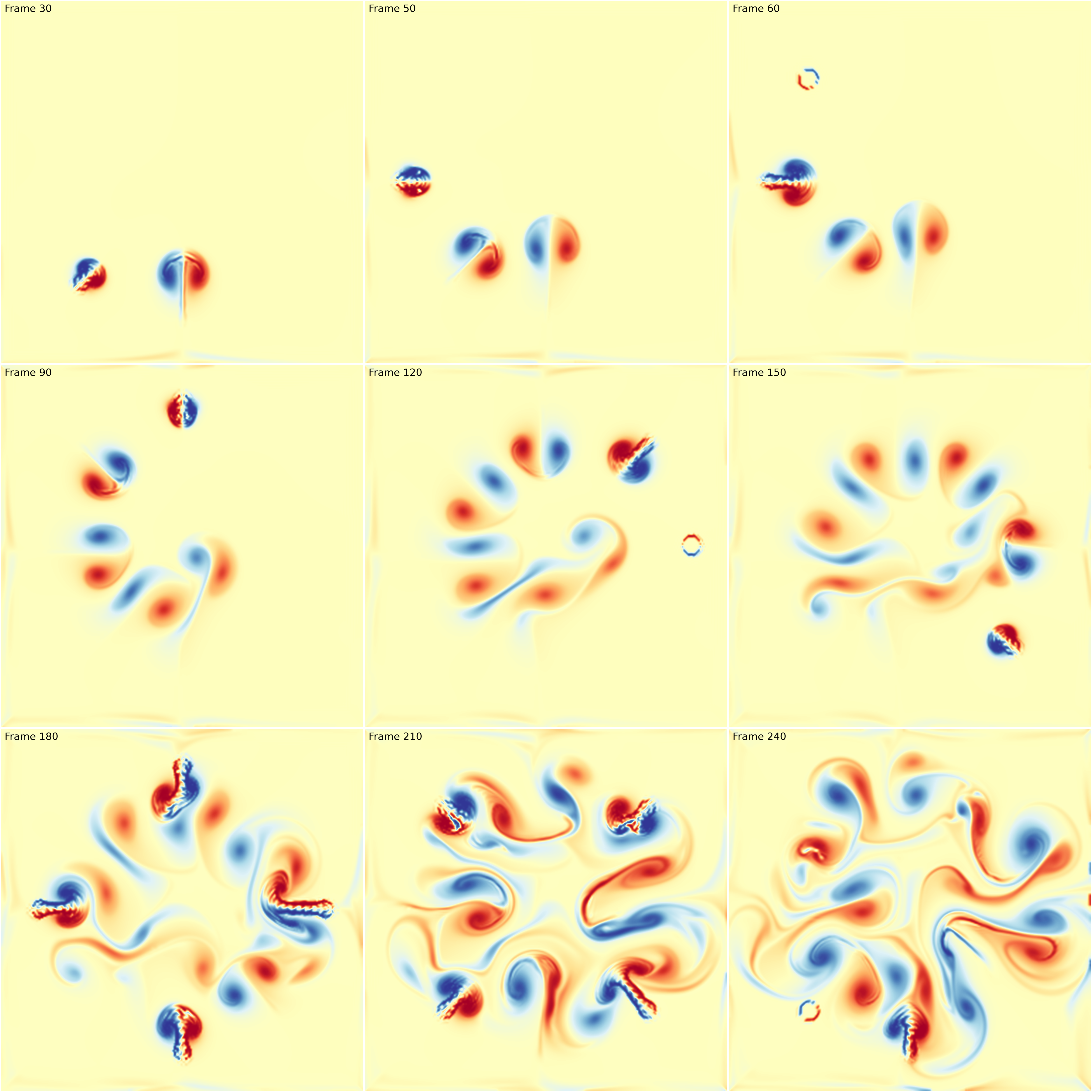
Fluid simulation figure-fluid-animation (sources: animation/fluid-animation.py).
Note that in the update function, I took care of updating the limits of the colormap. This is necessary because the displayed image is dynamic and the minimum and maximum values may vary from one frame ot the other. If you don’t do that, you might have some flickering.
You can also have much more elaborated scenario such as in the following example which is a remake of an animation originally designed by dark horse analytics.
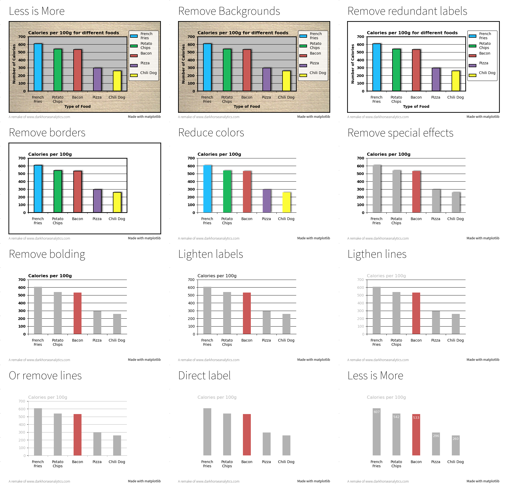
Less is more figure-less-is-more (sources: animation/less-is-more.py).
Exercise
The goal of this exercise is to create an animation showing how Lissajous curves are generated. Figure figure-lissajous shows a still from the animation. Make sure to try to copy the exact style.
Lissajous curves figure-lissajous (sources: animation/lissajous.py).
Going 3D
Matplotlib has a really nice 3D interface with many capabilities (and some limitations) that is quite popular among users. Yet, 3D is still considered to be some kind of black magic for some users (or maybe for the majority of users). I would thus like to explain in this chapter that 3D rendering is really easy once you’ve understood a few concepts. To demonstrate that, we’ll render the bunny on figure above with 60 lines of Python and one matplotlib call. That is, without using the 3D axis.
Stanford bunny. (sources: threed/bunny.py). figure-bunny
Loading the bunny
First things first, we need to load our model. We’ll use a simplified version of the Stanford bunny. The file uses the wavefront format which is one of the simplest format, so let’s make a very simple (but error-prone) loader that will just do the job for this specific model. Else, you can use the meshio library
V, F = [], []
with open("bunny.obj") as f:
   for line in f.readlines():
       if line.startswith('#'): continue
       values = line.split()
       if not values: continue
       if values[0] == 'v':
           V.append([float(x) for x in values[1:4]])
       elif values[0] == 'f':
           F.append([int(x) for x in values[1:4]])
V, F = np.array(V), np.array(F)-1
V is now a set of vertices (3D points if you prefer) and F is a set of faces (= triangles). Each triangle is described by 3 indices relatively to the vertices array. Now, let’s normalize the vertices such that the overall bunny fits the unit box:
V = (V-(V.max(0)+V.min(0))/2)/max(V.max(0)-V.min(0))
Now, we can have a first look at the model by getting only the x,y coordinates of the vertices and get rid of the z coordinate. To do this we can use the powerful PolyCollection object that allow to render efficiently a collection of non-regular polygons. Since, we want to render a bunch of triangles, this is a perfect match. So let’s first extract the triangles and get rid of the z coordinate:
T = V[F][...,:2]
We can now render it:
fig = plt.figure(figsize=(6,6))
ax = fig.add_axes([0,0,1,1], xlim=[-1,+1], ylim=[-1,+1],
                  aspect=1, frameon=False)
collection = PolyCollection(T, closed=True, linewidth=0.1,
                            facecolor="None", edgecolor="black")
ax.add_collection(collection)
plt.show()
Result is shown on figure figure-bunny-1.
Stanford bunny without any transformation. (sources: threed/bunny-1.py). figure-bunny-1
Perspective Projection
The rendering we’ve just made is actually an orthographic projection while the previous bunny uses a perspective projection:
Orthographic and perspective projections. figure-projections
In both cases, the proper way of defining a projection is first to define a viewing volume, that is, the volume in the 3d space we want to render on the scree. To do that, we need to consider 6 clipping planes (left, right, top, bottom, far, near) that enclose the viewing volume (frustum) relatively to the camera. If we define a camera position and a viewing direction, each plane can be described by a single scalar. Once we have this viewing volume, we can project onto the screen using either the orthographic or the perspective projection.
Fortunately for us, these projections are quite well known and can be expressed using 4x4 matrices:
def frustum(left, right, bottom, top, znear, zfar):
    M = np.zeros((4, 4), dtype=np.float32)
    M[0, 0] = +2.0 * znear / (right - left)
    M[1, 1] = +2.0 * znear / (top - bottom)
    M[2, 2] = -(zfar + znear) / (zfar - znear)
    M[0, 2] = (right + left) / (right - left)
    M[2, 1] = (top + bottom) / (top - bottom)
    M[2, 3] = -2.0 * znear * zfar / (zfar - znear)
    M[3, 2] = -1.0
    return M

def perspective(fovy, aspect, znear, zfar):
    h = np.tan(0.5*radians(fovy)) * znear
    w = h * aspect
    return frustum(-w, w, -h, h, znear, zfar)
For the perspective projection, we also need to specify the aperture angle that (more or less) sets the size of the near plane relatively to the far plane. Consequently, for high apertures, you’ll get a lot of “deformations”.
However, if you look at the two functions above, you’ll realize they return 4x4 matrices while our coordinates are 3d. How to use these matrices then ? The answer is homogeneous coordinates. To make a long story short, homogeneous coordinates are best to deal with transformation and projections in 3D. In our case, because we’re dealing with vertices (and not vectors), we only need to add 1 as the fourth coordinates (w) to all our vertices. Then we can apply the perspective transformation using the dot product.
V = np.c_[V, np.ones(len(V))] @ perspective(25,1,1,100).T
Last step, we need to re-normalize the homogeneous coordinates. This means we divide each transformed vertices with the last component (w) such as to always have w=1 for each vertices.
V /= V[:,3].reshape(-1,1)
Now we can check the result on figure figure-bunny-2 that looks totally wrong.
Wrong rendering when camera is inside. (sources: threed/bunny-2.py). figure-bunny-2
It looks wrong because the camera is actually inside the bunny. To have a proper rendering, we need to move the bunny away from the camera or to move the camera away from the bunny. Let’s do the later. The camera is currently positioned at (0,0,0) and looking up in the z direction (because of the frustum transformation). We thus need to move the camera away a little bit in the z negative direction and before the perspective transformation.
V = V - (0,0,3.5)
V = np.c_[V, np.ones(len(V))] @ perspective(25,1,1,100).T
V /= V[:,3].reshape(-1,1)
The corrected output is shown on figure figure-bunny-3.
Corrected rendering with camera away. (sources: threed/bunny-3.py). figure-bunny-3
Model, view, projection (MVP)
It might be not obvious, but the last rendering is actually a perspective transformation. To make it more obvious, we’ll rotate the bunny around. To do that, we need some rotation matrices (4x4) and we can as well define the translation matrix in the meantime:
def translate(x, y, z):
    return np.array([[1, 0, 0, x],
                     [0, 1, 0, y],
                     [0, 0, 1, z],
                     [0, 0, 0, 1]], dtype=float)

def xrotate(theta):
    t = np.pi * theta / 180
    c, s = np.cos(t), np.sin(t)
    return np.array([[1, 0,  0, 0],
                     [0, c, -s, 0],
                     [0, s,  c, 0],
                     [0, 0,  0, 1]], dtype=float)

def yrotate(theta):
    t = np.pi * theta / 180
    c, s = np.cos(t), np.sin(t)
    return  np.array([[ c, 0, s, 0],
                      [ 0, 1, 0, 0],
                      [-s, 0, c, 0],
                      [ 0, 0, 0, 1]], dtype=float)
We’ll now decompose the transformations we want to apply in term of model (local transformations), view (global transformations) and projection such that we can compute a global MVP matrix that will do everything at once:
model = xrotate(20) @ yrotate(45)
view  = translate(0,0,-3.5)
proj  = perspective(25, 1, 1, 100)
MVP   = proj  @ view  @ model
and we now write:
V = np.c_[V, np.ones(len(V))] @ MVP.T
V /= V[:,3].reshape(-1,1)
You should obtain results shown on figure figure-bunny-4.
Rotated and translated bunny. (sources: threed/bunny-4.py). figure-bunny-4
Let’s now play a bit with the aperture such that you can see the difference (see figure figure-bunny-5). Note that we also need to adapt the distance to the camera in order for the bunnies to have the same apparent size
Different apertures (sources: threed/bunny-5.py). figure-bunny-5
Depth sorting
Let’s try now to fill the triangles and see what happens (figure figure-bunny-6).
Rendering without depth sorting. (sources: threed/bunny-6.py). figure-bunny-6
As you can see, the result is totally wrong. The problem is that the PolyCollection draws the triangles in the order they are given while we would like to have them from back to front. This means we need to sort them according to their depth. The good news is that we already computed this information when we applied the MVP transformation. It is stored in the new z coordinates. However, these z values are vertices based while we need to sort the triangles. We’ll thus take the mean z value as being representative of the depth of a triangle. If triangles are relatively small and do not intersect, this works beautifully:
T =  V[:,:,:2]
Z = -V[:,:,2].mean(axis=1)
I = np.argsort(Z)
T = T[I,:]
And now everything is rendered correctly as shown on figure figure-bunny-7.
Rendering with depth sorting. (sources: threed/bunny-7.py). figure-bunny-7
Let’s add some colors using the depth buffer. We’ll color each triangle according to it depth. The beauty of the PolyCollection object is that you can specify the color of each of the triangle using a numpy array, so let’s just do that:
zmin, zmax = Z.min(), Z.max()
Z = (Z-zmin)/(zmax-zmin)
C = plt.get_cmap("magma")(Z)
I = np.argsort(Z)
T, C = T[I,:], C[I,:]
And our final display is show on figure figure-bunny-8.
Rendering with depth colors. (sources: threed/bunny-8.py). figure-bunny-8
The final script (threed/bunny-8.py) is 57 lines but hardly readable. However, it shows that 3D rendering can be done quite easily with matplotlib and a few transformations.
Exercises
Using the definition of the orthographic projection, try to reproduce the figure figure-bunnies that mix perspective (top left) and orthographic projections. Each bunny is contained in one axes.
Stanford bunnies (sources: threed/bunnies.py). figure-bunnies
Architecture & optimization
Even though a deep understanding of the matplotlib architecture is not necessary to use it, it is nonetheless useful to know a bit of its architecture to optimize either speed, memory and even rendering.
Transparency levels
We’ve already seen how to use transparency in a scatter plot to have a perception of data density. This works reasonably well if you don’t have too much data. But what is too much exactly? It would be hard to give a definitive limit because it depends on a number of parameters such as the size of your figure, the shape and size of your markers and the alpha level (i.e. transparency). For this latter, there is actually a limit in how much transparent a color can be and it is exactly 0.002 (= 1/500). This means that if you plot 500 black points with a transparency of 0.002, you obtain get a quasi black marker as shown on figure figure-transparency.
Transparency levels figure-transparency (sources: optimization/transparency.py).
It is not exactly black for 500 points because it also depends on how alpha compositing is computed internally but it provides nonetheless a useful approximation. Knowing this limit exists, it explains why you get a solid color in dense areas when you have a lot of data. This is illustrated on figure figure-scatters where the number of data is respectively 10,000, 100,000 and 1,000,000. For 10,000 and 100,000 points we can adapt the transparency level to show where are the dense areas. In this case, this is simple normal distribution and we can observe the central are is darker. For one million points, we reached the limit of the transparency trick (alpha=0.002) and we now have a central dark spot that hide information.
Scatter, hist2d and hexbin figure-scatters (sources: optimization/scatters.py).
This means we need a new strategy to display the data. Fortunately, matplotlib provides hist2d and hexbin that will both aggregate points into bins (with square or hex shape) that are eventually colored according to the number in the bins. This allows to visualize density for any number of data points and do not require to manipulate size and/or transparency of markers. You’re now ready to reproduce Todd W. Schneider’s astonishing visualization of NYC Taxi trips (Analyzing 1.1 Billion NYC Taxi and Uber Trips, with a Vengeance).
Alpha compositing induces other kind of problems with line plots, especially when a plot is self-covering itself as exemplified of a a high-frequency signal shown on figure figure-multisample. The signal is a product of two sine waves of different frequency and reads:
xmin, xmax = 0*np.pi, 5*np.pi
ymin, ymax = -1.1, +1.1
def f(x): return np.sin(np.power(x,3)) * np.sin(x)
X = np.linspace(xmin,xmax,10000)
Y = f(X)
When we plot this signal, we can see that the density of lines becomes higher and higher from left to right. Near the right side of the plot, the frequency is the highest and is actually higher than the screen resolution such that there is no empty spaces between successive waves. However, when we use a regular plot (first line of figure figure-multisample) with some transparency, we do not see a change in color (while we could expect the plot to self-cover itself). The reason is that matplotlib rendering engine takes care of not overdrawing an area that belong to the same plot as shown on the figure below:
Self-covering example figure-self-cover (sources: optimization/self-cover.py).
This explains why we do not have color change in figure figure-multisample. To counter this effect, we can render the same plot using a line collection made of individual segments. In such case, each segment is considered separately and will influence other segments. This corresponds to the second line on the figure and now we can observe a change in the color with darker colors on the right suggesting a higher frequency.
We can also adopt a totally different strategy by multisampling the signal, which is a standard techniques in signal processing. Instead of plotting the signal, I created an empty image with enough resolution and for each point (pixel) of this image, I considered 8 samples point randomly but closely distributed around the point to decide of its value. This is of course a slower compared to a regular plot but the rendering is more faithful to the signal as shown on the third line.
High-frequency signal. figure-multisample (sources: optimization/multisample.py).
Speed-up rendering
The overall speed of rendering a given figure depends on a number of matplotlib internal factors that are good to know. Even though the rendering speed is pretty decent in most cases, things can degrade very noticeably when you have a large number of objects and we’ve been already experienced such slowdown with the previous scatter plot examples. You may have noticed that there are two ways to render a scatter plot. Either you use the plot command with only markers or you use the dedicated scatter command. The two methods are similar and yet different. If you need a scatter plot where the size, shape and color of markers are the same, then you can use the plot command that is faster (by a factor of two approximately). For any other case, the scatter command is the one to use. We can try to measure the time to prepare a one million scatter plot using the following code:
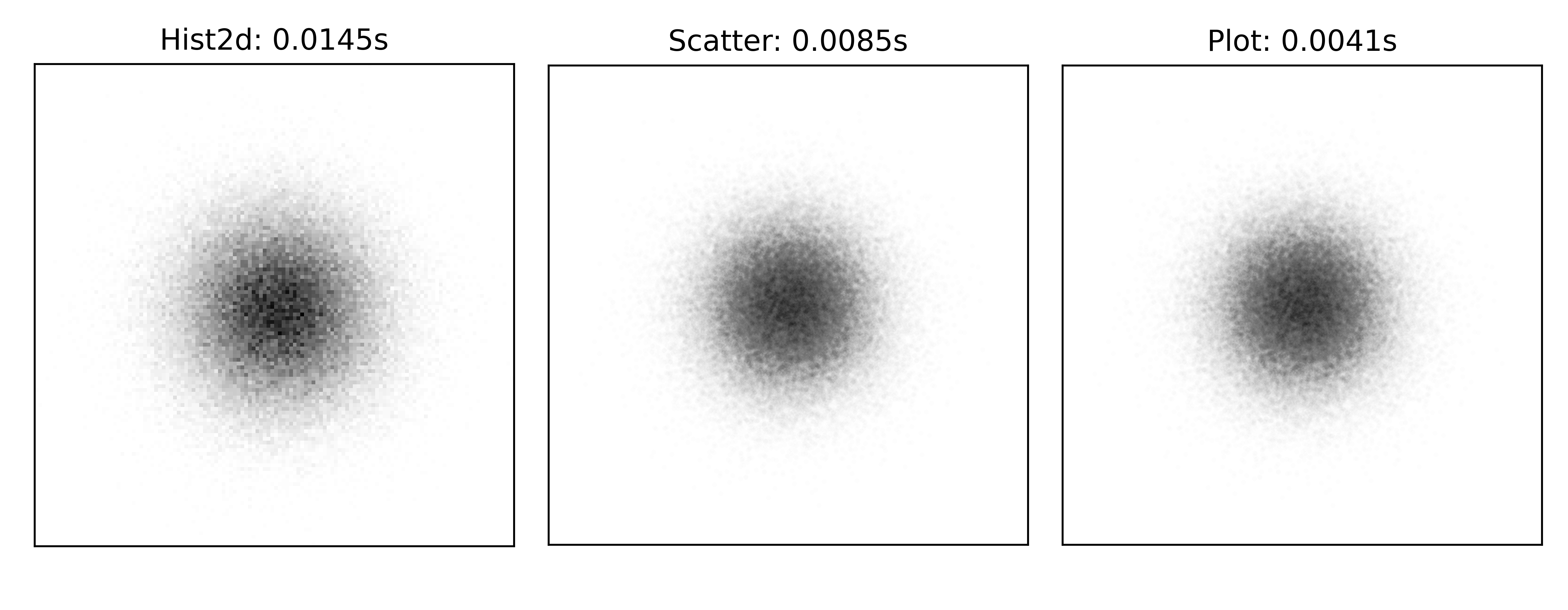
Scatter benchmark figure-scatter-benchmark (sources: optimization/scatter-benchmark.py).
By they way, you may have noticed the difference in size between plot (markersize=2) and scatter (s=2**2). The reason is that the size of marker in plot is measured in points while the size of markers in scatter is measured in squared points.
In the case of line plots, the difference in rendering speed between one solution or is the other can be dramatic as illustrated on figure figure-line-benchmark. In this example, I drew 1,000 line segments using 1,000 calls to the plot method (left), a single plot call (middle) with individual segment coordinates separated by None and a line collection (right). In this specific case, the choice of the rendering method makes a big difference such that for a large number of lines, your rendering can takes a few seconds or several minutes. Note that the fastest rendering (unified plot, middle) is not exactly equivalent to the others due to the absence of self-coverage as explained previously.
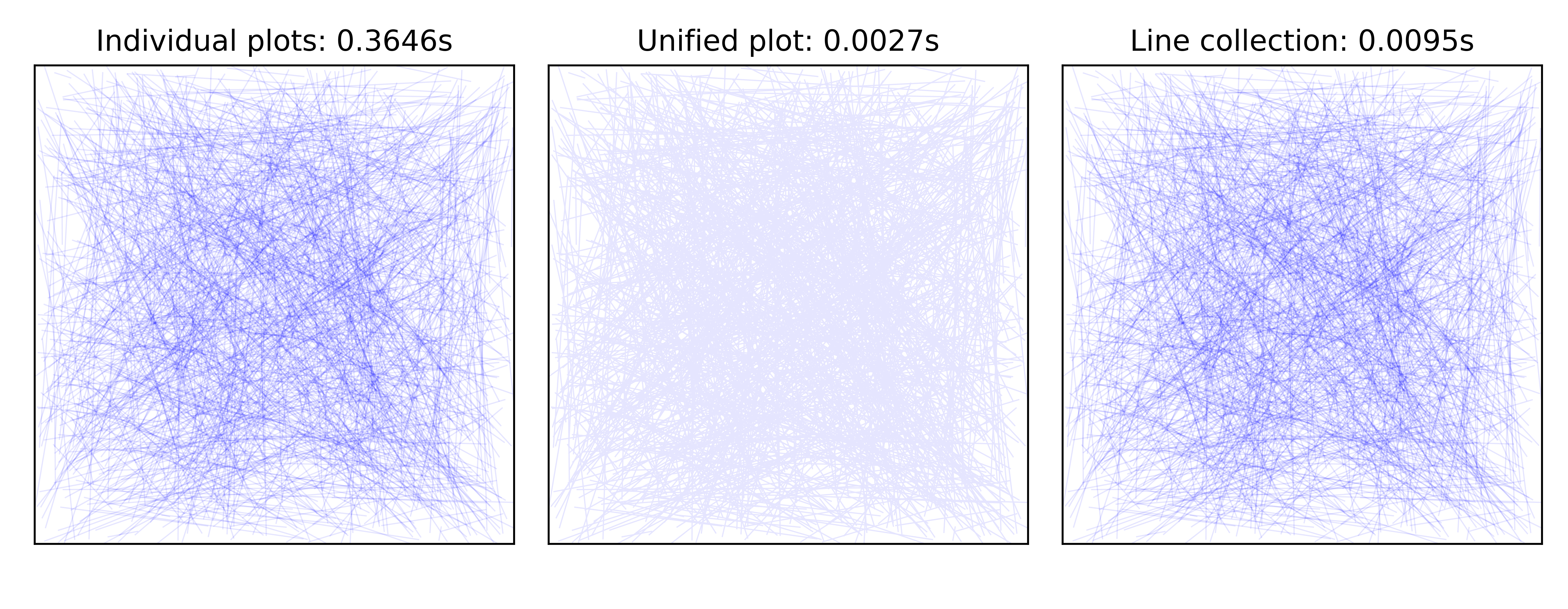
Line benchmark figure-line-benchmark (sources: optimization/line-benchmark.py).
File sizes
Depending on the format you save a figure, the resulting file can be relatively small but it can also be huge, up to several megabytes and this does not relate to the complexity of your script but rather to the amount of details or the number of elements. Let’s consider for example the following script:
plt.scatter(np.random.rand(int(1e6)), np.random.rand(int(1e6)))
plt.savefig("vector.pdf")
The resulting file size is approximately 15 megabytes. The reason for such a large file being the pdf format to be a vector format. This means that the coordinates of each point needs to be encoded. In our example, we have a million points and two float coordinates per points. If we consider a float to be represented by 4 bytes, we already need 8,000,000 bytes to store coordinates. If we now add individual color (4 bytes, RGBA ) and size (1 float, 4 bytes) we can easily reached 16 megabytes.
Let me now slightly modify the code:
plt.scatter(np.random.rand(int(1e6)), np.random.rand(int(1e6)),
            rasterized=True)
plt.savefig("vector.pdf", dpi=600)
The new file size is approximately 50 kilobytes and the quality is roughly equivalent even if it is not a pure vector format anymore. In fact, the rasterized keyword means that maplotlib will create a rasterized (i.e. bitmap) representation of the scatter plot saving a lot of memory when saved on disk. Incidentally, it will also make the rendering of your figure much faster because your pdf viewer does not need to render individual elements.
However, the combination of a vector format with rasterized elements is not always the best choice. For example, if you need to produce a huge figure (e.g. for a poster) with a very high definition, a pure vector format might be the best format provided you do not have too much elements. There’s no definitive recipes and the choice is mostly a matter of experience.
Multithread rendering
Multithread rendering is not natively supported by matplotlib but it is possible to do it anyway. The most obvious situation happens when you need to render several different plots. In such a case, there’s no real difficulty and it’s only matter of starting several threads concurrently. What is more interesting is to produce a single figure using multithread rendering. To do that, we need to split the figure into different and non overlapping parts such that each part can be rendered independently. Let’s consider, for example, a figure whose full extent is xlim=[0,9] and ylim=[0,9]. In such as case, we can define quit easily 9 non-overlapping parts:
X = np.random.normal(4.5, 2, 5_000_000)
Y = np.random.normal(4.5, 2, 5_000_000)

extents = [[x,x+3,y,y+3] for x in range(0,9,3)
                         for y in range(0,9,3)]
For each of these parts, we can plot an offline figure using a Figure Canvas and save the result in an image:
def plot(extent):

    xmin, xmax, ymin, ymax = extent
    fig = Figure(figsize=(2,2))
    canvas = FigureCanvas(fig)
    ax = fig.add_axes([0,0,1,1], frameon=False,
                      xlim = [xmin,xmax], xticks=[],
                      ylim = [ymin,ymax], yticks=[])
    epsilon = 0.1
    I = np.argwhere((X >= (xmin-epsilon)) &
                    (X <= (xmax+epsilon)) &
                    (Y >= (ymin-epsilon)) &
                    (Y <= (ymax+epsilon)))
    ax.scatter(X[I], Y[I], 3, clip_on=False,
        color="black", edgecolor="None", alpha=.0025)
    canvas.draw()
    return np.array(canvas.renderer.buffer_rgba())
Note that I took care of selecting X and Y that are inside the provided extent (modulo epsilon). This is quite important because we do not want to plot all the data in each subparts. Else, this would slow down things.
We can now put back every parts together using several imshow:
from multiprocessing import Pool

extents = [[x,x+3,y,y+3] for x in range(0,9,3)
                         for y in range(0,9,3)]
pool = Pool()
images = pool.map(plot, extents)
pool.close()

fig = plt.figure(figsize=(6,6))
ax = plt.subplot(xlim=[0,9], ylim=[0,9])
for img, extent in zip(images, extents):
    ax.imshow(img, extent=extent, interpolation="None")

plt.show()
If you look at the result on figure figure-multithread-rendering, you can observe a flawless montage of the different pieces. If you set the epsilon value to zero, you’ll observe white spaces appearing between the different parts. The reason is that if you enforce very strict clipping, a marker whose center is outside extent will not be drawn while it may overlap because of its size.
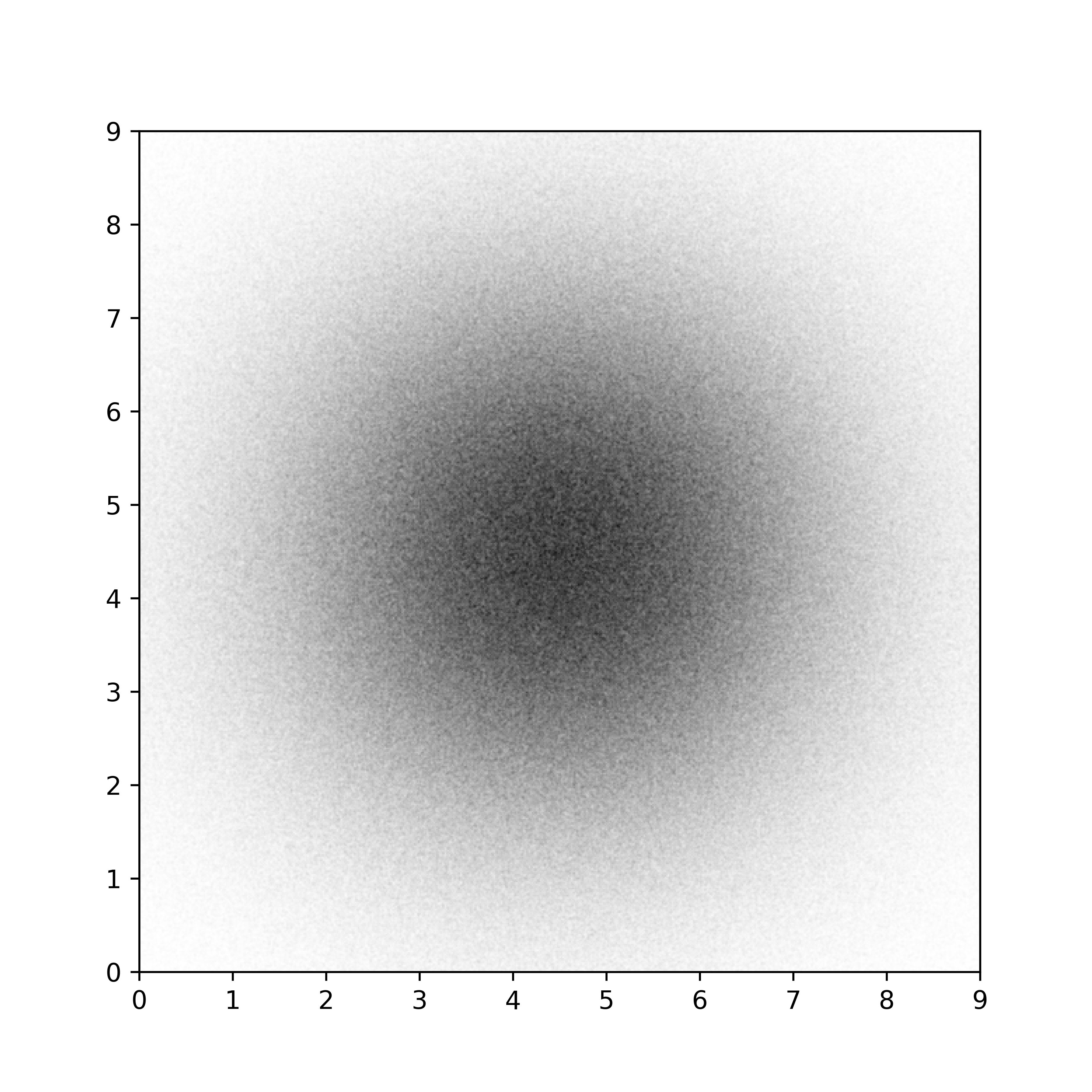
Multithread rendering figure-multithread-rendering (sources: optimization/multithread.py).
Such multithread rendering is not totally straightforward to implement because it depends on the possibility to split your in segregated elements. However, if you have a very complex plots that take several minutes to render, this is an option worth to be explored.
Graphic library
Beyond its usage for scientific visualization, matplotlib is also a comprehensive library for creating static, animated, and interactive visualizations in Python as written on the website. Said differently, matplotlib is a graphic library that can be used for virtually any purpose, even though the performance may vary greatly from one application to the other, depending on the complexity of the rendering. Such versatility can be explained by the presence of a number of low-level objects, that allow to produce virtually any rendering, and supported by a number of standard operations as shown on figure figure-polygon-clipping
Polygon clipping figure-polygon-clipping (sources: beyond/polygon-clipping.py).
Here is a first example showing the capability of matplotlib in terms of polygon and clipping. As you can see on figure figure-polygon-clipping, clipping allows to render any combination of two polygons.
Such clipping can be used as well in a regular figure to make some interesting effect as shown on figure figure-interactive-loupe.
Polygon clipping figure-interactive-loupe (sources: beyond/interactive-loupe.py).
Matplotlib dungeon
If you ever played role playing game (especially Dungeons & Dragons), you may have encountered “Dyson hatching” as shown on figure figure-matplotlib-dungeon (look at the outside border of the walls). This kind of hatching is quite unique and immediately identifies the plan as some kind of dungeon. This hatching has been originally designed by Dyson Logos who was kind enough to explain how he draws it (by hand). Question is then, how to reproduce it using matplotlib?
It’s actually not too difficult but it’s not totally straightforward either because we have to take care of several details to get a nice result. The starting point is a random two-dimensional distribution where points needs to be not too close to each other. To achieve such result, can use Bridson’s Algorithm which is a very popular method to produce such blue noise sample point distributions that guarantees that no two points are closer than a given distance. If you observe figure figure-bluenoise, you can see the algorithm makes a real difference when compared to either a pure uniform distribution or a regular grid with some normal jitters.
Uniform distribution, jittered grid and blue noise distribution figure-bluenoise (sources: beyond/bluenoise.py).
From this blue noise distribution, we can insert hatch pattern at each location with a random orientation. A hatch pattern is a set of n parallel lines with some noise:
def hatch(n=4, theta=None):
    theta = theta or np.random.uniform(0,np.pi)
    P = np.zeros((n,2,2))
    X = np.linspace(-0.5,+0.5,n,endpoint=True)
    P[:,0,1] = -0.5 + np.random.normal(0, 0.05, n)
    P[:,1,1] = +0.5 + np.random.normal(0, 0.05, n)
    P[:,1,0] = X + np.random.normal(0, 0.025, n)
    P[:,0,0] = X + np.random.normal(0, 0.025, n)
    c, s = np.cos(theta), np.sin(theta)
    Z = np.array([[ c, s],[-s, c]])
    return P @ Z.T
You can see the result in the center of figure figure-dyson-hatching. This starts to look like Dyson hatching but it is not yet satisfactory because hatches cover each others. To avoid that, we need to clip hatches using the corresponding voronoi cells. The easiest way to do that is to use the shapely library that provides methods to compute intersection with generic polygons. You can see the result on the right part of figure figure-dyson-hatching and it looks much nicer (in my honest opinion).
Dyson hatching figure-dyson-hatching (sources: beyond/dyson-hatching.py).
We are not done yet. Next part is to generate a dungeon. If you search for dungeon generator on the internet, you’ll find many generators, from the most basic ones to the much more complex. In my case, I simply designed the dungeon using inkscape and I extracted the coordinates of the walls from the svg file:
Walls = np.array([
    [1,1],[5,1],[5,3],[8,3],[8,2],[11,2],[11,5],[10,5],
    [10,6],[12,6],[12,8],[13,8],[13,10],[11,10],[11,12],
    [2,12],[2,10],[1,10],[1,7],[4,7],[4,10],[3,10],
    [3,11],[10,11],[10,10],[9,10],[9,8],[11,8],[11,7],
    [9,7],[9,5],[8,5],[8,4],[5,4],[5,6],[1,6], [1,1]])
walls = Polygon(Walls, closed=True, zorder=10,
                facecolor="white", edgecolor="None",
                lw=3, joinstyle="round")
ax.add_patch(walls)
The next step is to restrict the hatching to the vicinity of the walls. Since hatches corresponds to our initial point distribution, it is only a matter of filtering hatches whose centers are sufficiently close to any wall. It thus only requires to compute the distance of a point to a line segment. At this point, we do not care it the the hatch is inside or outside the dungeon since the internal hatches are hidden by the interior of the dungeon (see zorder above). I proceeded by adding dotted squares inside corridors using a collection of vertical and horizontal lines as well as some random “rocks” which are actually collection of small ellipses. Last, I added a nice title using an old looking font. I used Morris Roman font by Dieter Steffmann.
The result looks nice but it can be further improved. For example, we could introduce some noise in walls to suggest manual drawing, we could improve rocks by adding noise, etc. Matplotlib provides everything that is needed and the only limit is your imagination. If you’re curious on what could be achieved, make sure to have a look at one page dungeon by Oleg Dolya or the Fantasy map generator by Martin O’Leary.
Matplotlib dungeon figure-matplotlib-dungeon (sources: beyond/dungeon.py).
Tiny bot simulator
Using the same approach, it is possible to design a tiny bot simulator as shown on figure figure-tinybot which is a snapshot of the simulation. To design this simulator, I started by splitting the figure using gridspec as follows:
fig = plt.figure(figsize=(10,5), frameon=False)
G = GridSpec(8, 2, width_ratios=(1,2))
ax = plt.subplot( G[:,0], aspect=1, frameon=False)
...

for i in range(8): # 8 sensors
    sax = plt.subplot( G[i,1])
    ...
ax is the axes on the left showing the maze and the bot while sax are axes to display sensors value on the right. Maze walls are rendered using a line collection while the robot is rendered using a circle (for the body), a line (for the “head”, i.e. a line indicating direction) and a line collection for the sensors. The overall simulation is a matplotlib animation where the update function is responsible for updating the bot position and sensors values.
Tiny bot simulator figure-tinybot (sources: beyond/tinybot.py).
There is no real difficulty but the computation of sensors & wall intersection which can be vectorized using Numpy to make it fast:
def line_intersect(p1, p2, P3, P4):

    p1 = np.atleast_2d(p1)
    p2 = np.atleast_2d(p2)
    P3 = np.atleast_2d(P3)
    P4 = np.atleast_2d(P4)

    x1, y1 = p1[:,0], p1[:,1]
    x2, y2 = p2[:,0], p2[:,1]
    X3, Y3 = P3[:,0], P3[:,1]
    X4, Y4 = P4[:,0], P4[:,1]

    D = (Y4-Y3)*(x2-x1) - (X4-X3)*(y2-y1)

    # Colinearity test
    C = (D != 0)
    UA = ((X4-X3)*(y1-Y3) - (Y4-Y3)*(x1-X3))
    UA = np.divide(UA, D, where=C)
    UB = ((x2-x1)*(y1-Y3) - (y2-y1)*(x1-X3))
    UB = np.divide(UB, D, where=C)

    # Test if intersections are inside each segment
    C = C * (UA > 0) * (UA < 1) * (UB > 0) * (UB < 1)

    X = np.where(C, x1 + UA*(x2-x1), np.inf)
    Y = np.where(C, y1 + UA*(y2-y1), np.inf)
    return np.stack([X,Y],axis=1)
This simulator could be easily extended with a camera showing the environment in 3D using the renderer I introduced in chapter chap-3D. In the end, it is possible to write a complete simulator in a few lines of Python. The goal is of course not to replace a real simulator, but it comes handy to rapidly prototype an idea which is exactly what I did to study decision making using the reservoir computing paradigm.
Real example
When put together, these graphical primitives allow to draw quite elaborated figures as shown on figure figure-basal-ganglia. This figure comes from the article A graphical, scalable and intuitive method for the placement and the connection of biological cells that introduces a graphical method originating from the computer graphics domain that is used for the arbitrary placement of cells over a two-dimensional manifold. The figure represents a schematic slice of the basal ganglia (striatum and globus pallidus) that has been split in four different subfigures:
Subfigure A is made of a bitmap image showing an arbitrary density of neurons. I used a bitmap image because it is not yet possible to render such arbitrary gradient using matplotlib. However, I also read the corresponding SVG image to extract the paths delimiting each structure and plot them on the figure.
Subfigure B represents the actual method for positioning an arbitrary number of neurons enforcing the density represented by the color gradient. To represent them, I used a simple scatter plot and colored some neurons according to their input/output status.
Subfigure C represents an interpolation of the activity of the neurons and has been made using a 2D histogram mode. To do that, I simply built a big array representing the whole image and I set the activity around the neuron using a disc of constant radius. This is only a matter of translating the 2d coordinates of the neuron to a 2D index inside the image array. I then used an imshow to show the result and I drew over the frontiers of each structure. This kind of rendering helps to see the overall activity inside the structure.
Subfigure D is probably the most complex because it involved the computation of Voronoi cells and their intersection with the border of the structure. Once again, the shapely library is incredibly useful to achieve such result. Once the cell have been computed, it is only a matter of painting them with a colormap according to their activity. For efficiency, this is made using a poly collection.
This is actually quite a complex example, but once you’ve written the code, it can be adapted to any input (the SVG file in this case) such that your final result is fully automated. Of course, the amount of work this represents should be balanced with your actual needs. If you need the figure only once, it is probably not worth the effort if you can do it manually.
A schematic view of a slice of the basal ganglia. Sources availables from the spatial-computation repository on GitHub. figure-basal-ganglia
Exercises
Stamp like effect Fancy boxes offer several style that can be used to achieve different effect as shown on figure figure-mona-lisa-stamp. The goal is to achieve the same effect.
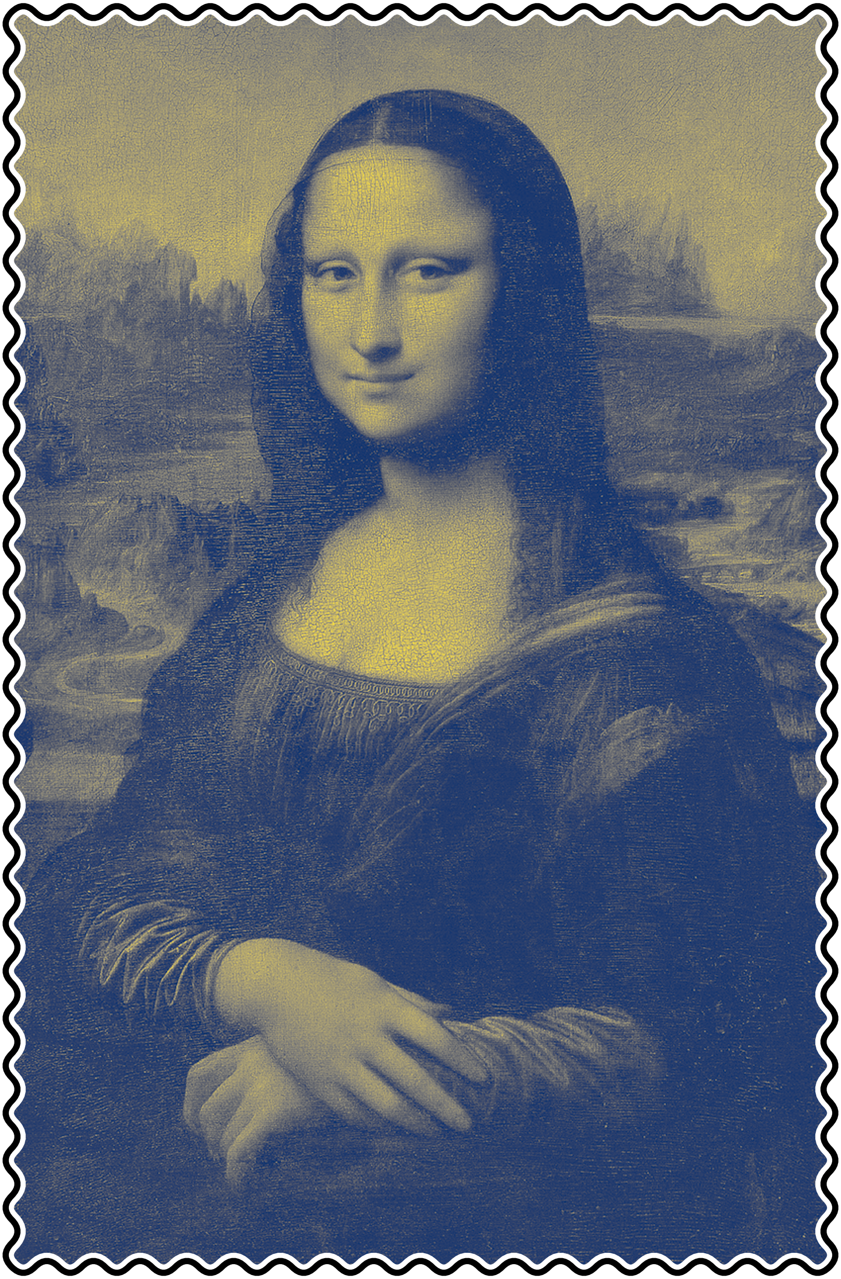
Mona Lisa stamp figure-mona-lisa-stamp (sources: beyond/stamp.py).
Radial Maze Try to redo the figure figure-radial-maze which displays a radial maze (that is used quite often in neuroscience to study mouse or rat behavior) and a simulated path representing a rat exploring the maze (this has been generated by recording the (computer) mouse movements). The color of each block represents the occupancy rate, that is, the number of recorded point inside the block.
Radial maze figure-radial-maze (sources: beyond/radial-maze.py).
Showcase
Showtime.
Filled contours with dropshadows is a nice effet that allows you to use a sequential colormap (here Viridis) while distinguishing positive and negative values. If you look closely at the figure, you can see that the drop shadow is external for positive values and internal for negative values. To achieve this result, the contours need to be rendered individually twice. In the first pass, I render a contour offscreen and read the resulting image into an array. I then use a Gaussian filter to blur it a bit and transform the image to make it full black but the alpha channel. I can then display the image using imshow and it will gracefully blend with elements already presents in the figure. I then add the same contour using the colormap and I iterate the process. The trick is to start from bottom to top such that dropshadows remain visible.
Sources: showcases/contour-dropshadow.py
Domain coloring is a “technique for visualizing complex functions by assigning a color to each point of the complex plane. By assigning points on the complex plane to different colors and brightness, domain coloring allows for a four dimensional complex function to be easily represented and understood. This provides insight to the fluidity of complex functions and shows natural geometric extensions of real functions” [Wikipedia]. On the figure on the left, I represented the imaginary function \(z + \nicefrac{1}{z}\) in the domain \([-2.5, 2.5]^2\). I used the angle of the (complex) result for setting the color and the absolute cosine of the norm for modulating it periodically. I could have used a cyclic colormap such as twilight but I think the Spectral is visually more pleasant, even though it induces some discontinuities. To draw the grid, I used a contour plot using integer values in the real and imaginary domain.
Sources: showcases/domain-coloring.py
Escher like projections can be obtained using the complex exponential function and some specific periods that can be computed quite easily. To do the figure on the left, I mostly followed explanations given by Craig S. Kaplan, professor at the University of Waterloo on his blog post Escher-like Spiral Tilings (2019). The only difficulty in making this figure is line thickness. If you compare this figure with the previous one, you may have noticed that in the previous figure, lines have a constant thickness while in this figure, thickness varies. To achieve such effect, we have to use a polygon made of several segment with varying thickness. This poses no real difficulty, only some geometrical computations.
Sources: showcases/escher.py
Self-organizing map (SOM) “is a type of artificial neural network that is trained using unsupervised learning to produce a low-dimensional (typically two-dimensional), discretized representation of the input space of the training samples, called a map, and is therefore a method to do dimensionality reduction” [Wikipedia]. I developed with Georgios Detorakis a randomized self-organizing map based on blue noise distribution of neurons. The figure on the left shows the self-organisation of the map when fed with random RGB colors. The figure itself is made of a polygon collection where each polygon is painted with the color of the neuron. No real difficuly but I had to take care fo disabling antialias, else, thin lines appear between polygons.
Sources: github.com/rougier/VSOM
Waterfall plot “is a three-dimensional plot in which multiple curves of data, typically spectra, are displayed simultaneously. Typically the curves are staggered both across the screen and vertically, with ‘nearer’ curves masking the ones behind. The result is a series of “mountain” shapes that appear to be side by side. The waterfall plot is often used to show how two-dimensional information changes over time or some other variable” [Wikipedia] To do the figure, I used a 3D axis and polygons (i.e. not filled plot). The reason to use polygon is to obtain the color gradient effect on each curve. The only way to do that (to the best of my knowledge), is to slice horizontally each curve in several stripes and to render the slice using a specific color. The difficulty is to compute those irregular slices and this is the reason I use the Shapely library that allows, among many other things, to compute the intersection between polygons.
Sources: showcases/waterfall-3d.py
Streamlines are a “family of curves that are instantaneously tangent to the velocity vector of the flow. These show the direction in which a massless fluid element will travel at any point in time” [Wikipedia]. The figure on the left shows such stream lines and is actually a still from an animation. Each streamline has been split into line segments and gathered in a line collection such that each segment has its own color. From there, it is easy to suggest stream direction using gradients. Note that I could have used a single line collection for all streamlines. Strangely enough, the only difficulty in this figure are the line round caps. For the reason explained here, I had to create a specific graphic context such as to have round caps.
Sources: showcases/windmap.py
The Mandelbrot set “is the set of complex numbers \(c\) does not diverge when iterated from \(z = 0\), i.e., for which the sequence \(f_{c}(0)\), \(f_{c}(f_{c}(0))\), etc., remains bounded in absolute value [Wikipedia]. To plot the figure on the left, I used a regular imshow with shading and normalized recounts that is explained on this post Smooth Shading for the Mandelbrot Exterior. The script is also present in the matplotlib gallery which I contributed some years ago.
Sources: showcases/mandelbrot.py
This recursive Voronoi set has been quite painful to design because it requires some quite precise settings to obtain what I think is a beautiful result. These settings are the placement of random points with good visual properties and for that, I use the Fast Poisson Disk Sampling by Robert Bridson which is simple and fast. I also use quite extensively the shapely library to clip he different polygons and I discovered in the meantime how to draw random points inside a polygon. Finally, I played with lines thickness, polygons color and transparency to achieve this result, involving 5 levels of recursion. On my computer, it takes around 1 minute to compute.
Sources: showcases/recursive-voronoi.py
A 3D heightmap of Mount St Helens after it exploded. This has been made with my experimental 3D axis. Nothing really complicated here, just a bit slow because it needs to sort a bunch of triangles.
This Voronoi mosaic is based on blue noise distribution where each Voronoi cell has been painted according to the color of the center of the Voronoi cell in the original image. This results in a cheap stained glass window effect.
Sources: showcases/mosaic.py
This shadowed text is harder to design than it seems. I started from a text path object and iterated over the segments composing the path in order to create sheared rectangles that constitute the shadow. To make the shadow disappear in the background, I created an image with a vertical gradient using semi-transparent color (fully transparent on top and fully opaque on the bottom). This results in a nice fading shadow effect.
Sources: showcases/text-shadow.py
This spiral text has been made using an Archimedean spiral (\(r = a + b\theta\)) that guarantees a constant speed along a line that rotates with constant angular velocity. Said differently, successive turnings of the spiral have a constant separation distance. Starting from a very long text path representing some of the decimals of pi (using the mpmath library), it’s then only a matter of transforming the vertices to follow the spiral.
Sources: showcases/text-spiral.py
Conclusion
You’ve now reached the end of this book that took me nearly two years to write, mostly due to the pandemic that slowed down things quite a bit. I’m not totally satisfied with the result because there is a lot of features I wanted to introduce but I’ve never found the time to do so and the book had to be released at some point. This will be included in the second edition, depending how the first edition is perceived by the community.
In any case, I hope you’ll find the book useful for your own work and spread the word if you like it. If you want to support my work, you can buy a printed edition on Amazon.
Appendix
External resources
One of the strength of matplotlib is the extensive documentation available from the website. But there is also a large set of external resources that are incredibly useful when you’re looking to design a specific figure:
The matplotlib documentation is the primary source of information whenever you need to know the parameters of this or that function. It has also a very well written set of tutorials that are worth to be read:
The starter guide helps you to get started with Matplotlib
The pyplot tutorial is an introduction to the pyplot interface
The image tutorial explains the basic of image display
The catalogue shows some neat and standard visualizations
The frequently asked questions are worth a read
Online help is available from two mailing lists (users and developers) and from stack overflow which has a dedicated matplotlib tag and a lot of questions have been asked and answered:
Stack overflow (more than 40,000 questions related to matplotlib)
There exist various galleries online among which the matplotlib gallery that is probably the best gallery to start with. The other galleries are worth a look because they explain the rationale for each kind of plot:
The Matplotlib Gallery is probably the best resource if you’re looking for how to do a specific figure. Just search for the closest example and get the code.
The Data Visualization Catalogue is a project developed by Severino Ribecca to create a library of different information visualisation types.
The Python Graph gallery displays hundreds of charts and aims to showcase the awesome dataviz possibilities of Python.
The R Graph Gallery is a collection of charts made displayed in several sections, always with their (R) reproducible code available.
Finally, there exists many books about matplotlib and data visualization. I selected only a few of them that are well written and open access. You can find them in the chap-bibliography appendix.
Quick References
Here are cheatsheets and handouts I’ve designed for Matplotlib. They are also available in A4 format at github.com/matplotlib/cheatsheets.