Animation
Animation with matplotlib can be created very easily using the animation framework. Let’s start with a very simple animation. We want to make an animation where the sine and cosine functions are plotted progressively on the screen. To do that, we need first to tell matplotlib we want to make an animation and then, we have to specify what we want to draw at each frame. One common mistake is to re-draw everything at each frame that makes the whole process very slow. Instead, we can only update what is necessary because we know that (in our case) a lot of things won’t change from one frame to the other. For a line plot, we’ll use the set_data method to update the drawing and matplotlib will take care of of the rest.
import numpy as np
import matplotlib.pyplot as plt
import matplotlib.animation as animation

fig = plt.figure(figsize=(7,2), dpi=100)
ax = plt.subplot()

X = np.linspace(-np.pi, np.pi, 256, endpoint=True)
C, S = np.cos(X), np.sin(X)
line1, = ax.plot(X, C, marker="o", markevery=[-1],
                       markeredgecolor="white")
line2, = ax.plot(X, S, marker="o", markevery=[-1],
                       markeredgecolor="white")

def update(frame):
    line1.set_data(X[:frame], C[:frame])
    line2.set_data(X[:frame], S[:frame])

ani = animation.FuncAnimation(fig, update, interval=10)
plt.show()
Notice the end point marker that move with the animation. The reason is that we specify a single marker at the end (markevery=[-1]) such that each time we set new data, marker is automatically updated and moves with the animation. See figure figure-animation-sine-cosine.
Snapshots of the sine cosine animation figure-animation-sine-cosine (sources: chapter-12/sine-cosine.py).
If we now want to save this animation, matplotlib can create a movie file but options are rather scarce. A better solution is to use an external library such as FFMpeg which is available on most systems. Once installed, we can use the dedicated FFMpegWriter as shown below:
writer = animation.FFMpegWriter(fps=30)
anim = animation.FuncAnimation(fig, update, interval=10, frames=len(X))
anim.save("sine-cosine.mp4", writer=writer, dpi=100)
You may have noticed that when we save the movie, the animation does not start immediately because there is actually a delay that corresponds to the movie creation. For sine and cosine, the delay is rather short and it is not really a problem. However, for long and complex animations, this delay can become quite significant and it becomes necessary to track its progress. So let’s add some information using the tqdm library.
from tqdm.autonotebook import tqdm
bar = tqdm(total=len(X))
anim.save("../data/sine-cosine.mp4", writer=writer, dpi=300,
          progress_callback = lambda i, n: bar.update(1))
bar.close()
Creation time remains the same, but at least now, we can check how slow or fast it is. Here is some output of the animation:
Still from the sine/cosine animation (sources animation/sine-cosine.py).
Make it rain
A very simple rain effect can be obtained by having small growing rings randomly positioned over a figure. Of course, they won’t grow forever since ripples are supposed to damp with time. To simulate this phenomenon, we can use an increasingly transparent color as the ring is growing, up to the point where it is no more visible. At this point, we remove the ring and create a new one. First step is to create a blank figure.
fig = plt.figure(figsize=(6,6), facecolor='white', dpi=50)
ax = fig.add_axes([0,0,1,1], frameon=False, aspect=1)
ax.set_xlim(0,1), ax.set_xticks([])
ax.set_ylim(0,1), ax.set_yticks([])
Then we create an empty scatter plot but we take care of settings linewidth (0.5) and facecolors (“None”) that will apply to any new data.
scatter = ax.scatter([], [], s=[], lw=0.5,
                     edgecolors=[], facecolors="None")
Next, we need to create several rings. For this, we can use the scatter plot object that is generally used to visualize points cloud, but we can also use it to draw rings by specifying we don’t have a facecolor. We also have to take care of initial size and color for each ring such that we have all sizes between a minimum and a maximum size. In addition, we need to make sure the largest ring is almost transparent.
n = 50
R = np.zeros(n, dtype=[ ("position", float, (2,)),
                        ("size",     float, (1,)),
                        ("color",    float, (4,)) ])
R["position"] = np.random.uniform(0, 1, (n,2))
R["size"] = np.linspace(0, 1, n).reshape(n,1)
R["color"][:,3] = np.linspace(0, 1, n)
Now, we need to write the update function for our animation. We know that at each time step each ring should grow and become more transparent while the largest ring should be totally transparent and thus removed. Of course, we won’t actually remove the largest ring but re-use it to set a new ring at a new random position, with nominal size and color. Hence, we keep the number of rings constant.
def rain_update(frame):
    global R, scatter

    # Transparency of each ring is increased
    R["color"][:,3] = np.maximum(0, R["color"][:,3] - 1/len(R))

    # Size of each rings is increased
    R["size"] += 1/len(R)

    # Reset last ring
    i = frame % len(R)
    R["position"][i] = np.random.uniform(0, 1, 2)
    R["size"][i] = 0
    R["color"][i,3] = 1

    # Update scatter object accordingly
    scatter.set_edgecolors(R["color"])
    scatter.set_sizes(1000*R["size"].ravel())
    scatter.set_offsets(R["position"])
Last step is to tell matplotlib to use this function as an update function for the animation and display the result (or save it as a movie):
animation = animation.FuncAnimation(fig, rain_update,
                                    interval=10, frames=200)
Still from the rain animation (sources animation/rain.py).
Visualizing earthquakes on Earth
We’ll now use the rain animation to visualize earthquakes on the planet from the last 30 days. The USGS Earthquake Hazards Program is part of the National Earthquake Hazards Reduction Program (NEHRP) and provides several data on their website. Those data are sorted according to earthquakes magnitude, ranging from significant only down to all earthquakes, major or minor. You would be surprised by the number of minor earthquakes happening every hour on the planet. Since this would represent too much data for us, we’ll stick to earthquakes with magnitude > 4.5. At the time of writing, this already represent more than 300 earthquakes in the last 30 days.
First step is to read and convert data. We’ll use the urllib library that allows us to open and read remote data. Data on the website use the CSV format whose content is given by the first line:
time,latitude,longitude,depth,mag,magType,nst,gap,dmin,rms,...
2015-08-17T13:49:17.320Z,37.8365,-122.2321667,4.82,4.01,mw,...
2015-08-15T07:47:06.640Z,-10.9045,163.8766,6.35,6.6,mwp,...
We are only interested in latitude, longitude and magnitude and consequently, we won’t parse the time of event.
import urllib
import numpy as np

# -> http://earthquake.usgs.gov/earthquakes/feed/v1.0/csv.php
feed = "http://earthquake.usgs.gov/" \
     + "earthquakes/feed/v1.0/summary/"

# Magnitude > 4.5
url = urllib.request.urlopen(feed + "4.5_month.csv")

# Magnitude > 2.5
# url = urllib.request.urlopen(feed + "2.5_month.csv")

# Magnitude > 1.0
# url = urllib.request.urlopen(feed + "1.0_month.csv")

# Reading and storage of data
data = url.read().split(b'\n')[+1:-1]
E = np.zeros(len(data), dtype=[('position',  float, (2,)),
                               ('magnitude', float, (1,))])

for i in range(len(data)):
    row = data[i].split(b',')
    E['position'][i] = float(row[2]),float(row[1])
    E['magnitude'][i] = float(row[4])
We need to draw the earth to show precisely where the earthquake center is and to translate latitude/longitude in some coordinates matplotlib can handle. Fortunately, there is the cartopy library that is not so simple to install but really easy to use.
First step is to define a projection to draw the earth onto a screen. There exists many different projections but we’ll use the Equirectangular projection which is rather standard for non-specialists like me.
import cartopy.crs as ccrs
import matplotlib.pyplot as plt

fig = plt.figure(figsize=(10,5))
ax = plt.axes(projection=ccrs.PlateCarree())
ax.coastlines()

plt.show()
Equirectangular projection figure-animation-equirectangular (sources: animation/platecarree.py).
We can now adapt the rain animation to display eartquakes. To do that, we just need to add a transform to the scatter plot such that coordinates will be automatically transformed (by cartopy).
scatter = ax.scatter([], [], transform=ccrs.PlateCarree())
Earthquakes still (July 23, 2021 at 11am CET) figure-animation-earthquakes (sources: animation/earthquakes.py).
Scenarized animation
We’ve seen the basic principles of animation. It is now time to define a more elaborated scenario for our animation. To do that, we’ll play with fluid simulation because it’s fun. In animation/fluid.py, you’ll find an implementation of stable fluid simulation written by Gregory Johnson based on the paper of Joe Stam.
I’ve modified the original script and written an inflow method that define a source at a given position (angle). At each frame, we want to define active sources such that the overall animation displays a sequence of emitting sources.
In the scenario below, I define arbitrarily a rotating sequence of sources to maximize blending in the center but you could also imagine synchronizing this animation with some music for example.
import numpy as np
from fluid import Fluid, inflow
from scipy.special import erf
import matplotlib.pyplot as plt
import matplotlib.animation as animation

shape = 256, 256
duration = 500
fluid = Fluid(shape, 'dye')
inflows = [inflow(fluid, x)
           for x in np.linspace(-np.pi, np.pi, 8, endpoint=False)]

# Animation setup
fig = plt.figure(figsize=(5, 5), dpi=100)
ax = fig.add_axes([0, 0, 1, 1], frameon=False)
ax.set_xlim(0, 1); ax.set_xticks([]);
ax.set_ylim(0, 1); ax.set_yticks([]);
im = ax.imshow( np.zeros(shape), extent=[0, 1, 0, 1],
                vmin=0, vmax=1, origin="lower",
                interpolation='bicubic', cmap=plt.cm.RdYlBu)

# Animation scenario
scenario = []
for i in range(8):
    scenario.extend( [[i]]*20 )
scenario.extend([[0,2,4,6]]*30)
scenario.extend([[1,3,5,7]]*30)

# Animation update
def update(frame):
    frame = frame % len(scenario)
    for i in scenario[frame]:
        inflow_velocity, inflow_dye = inflows[i]
        fluid.velocity += inflow_velocity
        fluid.dye += inflow_dye
    divergence, curl, pressure = fluid.step()
    Z = curl
    Z = (erf(Z * 2) + 1) / 4

    im.set_data(Z)
    im.set_clim(vmin=Z.min(), vmax=Z.max())

anim = animation.FuncAnimation(fig, update, interval=10, frames=duration)
plt.show()
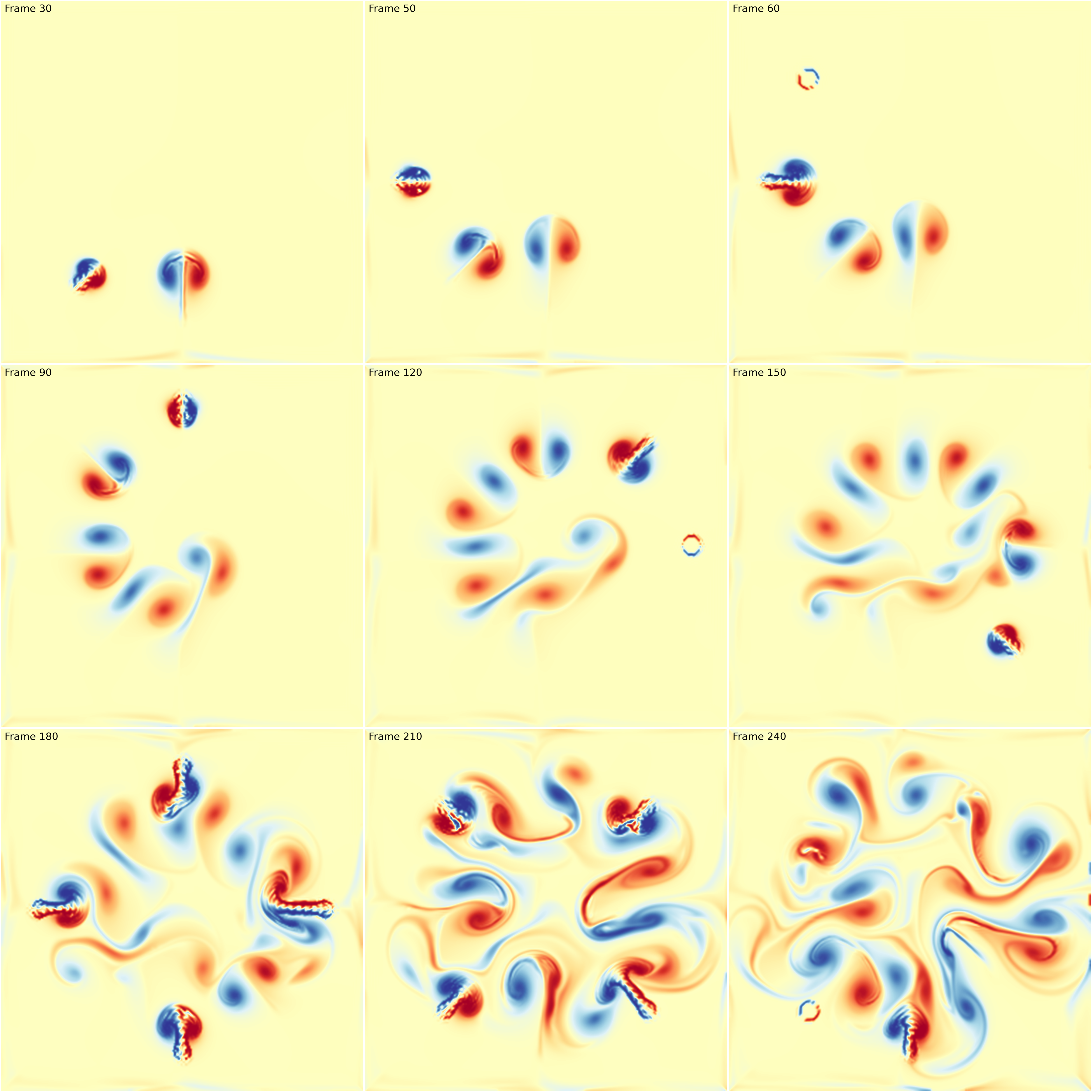
Fluid simulation figure-fluid-animation (sources: animation/fluid-animation.py).
Note that in the update function, I took care of updating the limits of the colormap. This is necessary because the displayed image is dynamic and the minimum and maximum values may vary from one frame ot the other. If you don’t do that, you might have some flickering.
You can also have much more elaborated scenario such as in the following example which is a remake of an animation originally designed by dark horse analytics.
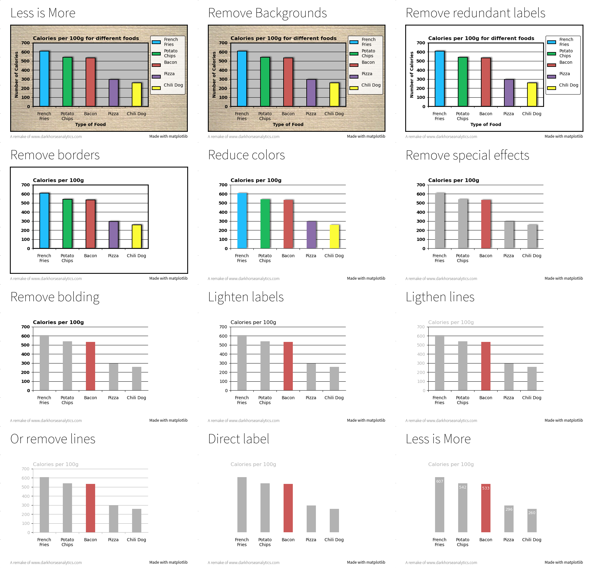
Less is more figure-less-is-more (sources: animation/less-is-more.py).
Exercise
The goal of this exercise is to create an animation showing how Lissajous curves are generated. Figure figure-lissajous shows a still from the animation. Make sure to try to copy the exact style.
Lissajous curves figure-lissajous (sources: animation/lissajous.py).